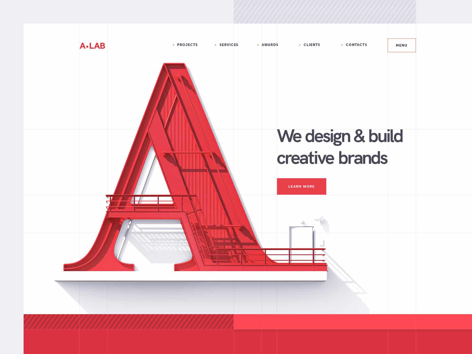
A piece of graphic design is only as good as its typography.
When it comes to creating brochures, flyers, logos, apps, web pages, or any graphic design element, it needs to be eye-catching and well put-together. Otherwise, people won’t bother to look at it, let alone try to learn more about your brand.
That makes typography the heart of quality graphic design. The brands you know and love have all developed their logos and marketing campaigns over the years, all of which follow a well-studied pattern of typefaces, colors, and texts, becoming the memorable references they are today.
What is Typography, and Why is it So Important?
In simple terms, typography is an art that consists in arranging text in a legible, striking, and engaging way. But of course, a lot of work and technique goes behind it.
Typography is more than typing in a pretty font and calling it a day. It’s a strategic arrangement that takes into account the following elements:
- Typefaces
- Fonts
- Hierarchy
- Consistency
- Alignment
- Whitespace
- Color
A designer unites all of the above elements to create remarkable designs for a variety of mediums and purposes.
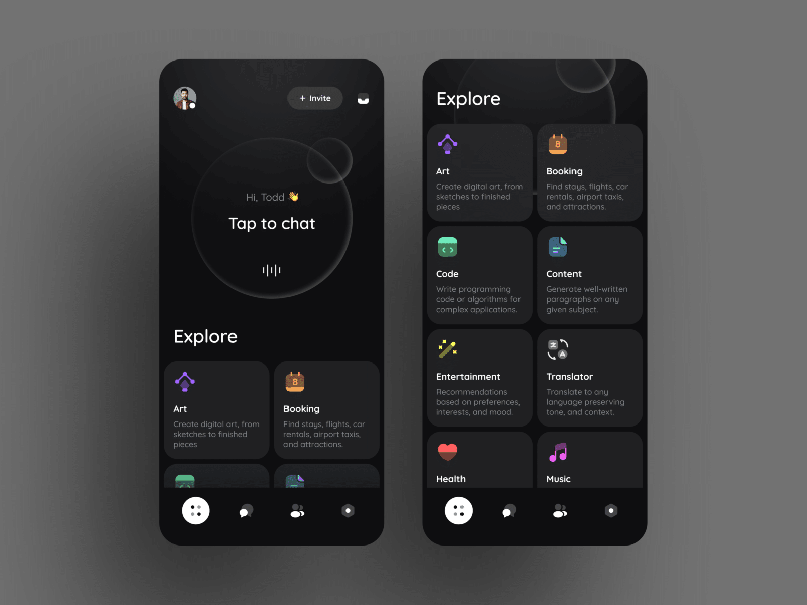
For instance, Los Angeles app design and development agency Creative27 regards typography as a crucial element of app design. A lot of people think of app development as nothing but a “tech-y” approach—little do they know, quality graphic design is at the core of app success.
Now, the million-dollar question is:
How does Great Typography Make any Design Irresistible?
1. It Catches the Eye
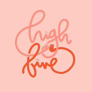
Nothing makes a beautiful quote stand out more than a perfect combination of the right fonts and colors with just the right sizes and nuances. It’s satisfying. Even the most common phrase can turn heads if the typography is on point.
People process visual elements 60,000 times faster than text, meaning that quality design is almost certain to grab the attention of whoever lands their eyes on it. People are far more likely to remember what they saw, as well.
2. Reading Becomes Easier
People read less nowadays. There’s so much information competing for our attention (e-mails, articles, text messages, memes) that if someone decides to read something, it better be good. And readable. If it’s not, they’ll simply drop it and move on to something else.
Now, readability isn’t only about a font that’s pretty to read. In fact, there are fonts so frilly that words become nearly impossible to make out. But that also doesn’t mean you should stick to overly simple fonts. The word here is “balance”.
It’s about the correct amount of whitespace in a block of text. It’s about the correct alignment and spacing between letters, and a pleasant combination of different fonts and complimenting colors.
3. Establishes Brand Recognition
Think about the logo of a famous brand. Any brand.
You might not have the clearest picture in your head, but you remember a few traces: the colors, the size, and maybe even the fonts. That’s exactly what good typography should do.
The job of a graphic designer is to create a visual identity that resonates with a brand’s principles. For example:
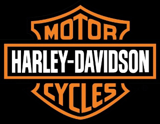
Harley-Davidson, a motorcycle brand that represents freedom for wild riders, boasts bold and strong fonts in its logo.
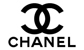
Chanel, a luxurious, expensive, and elegant brand uses a simple yet fine black font for its logo.
See the difference?
4. Adds Personality and Feeling
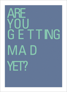
Remember how we said dull phrases come to life with quality typography? That’s because designers can make people feel something depending on how they choose to combine text elements.
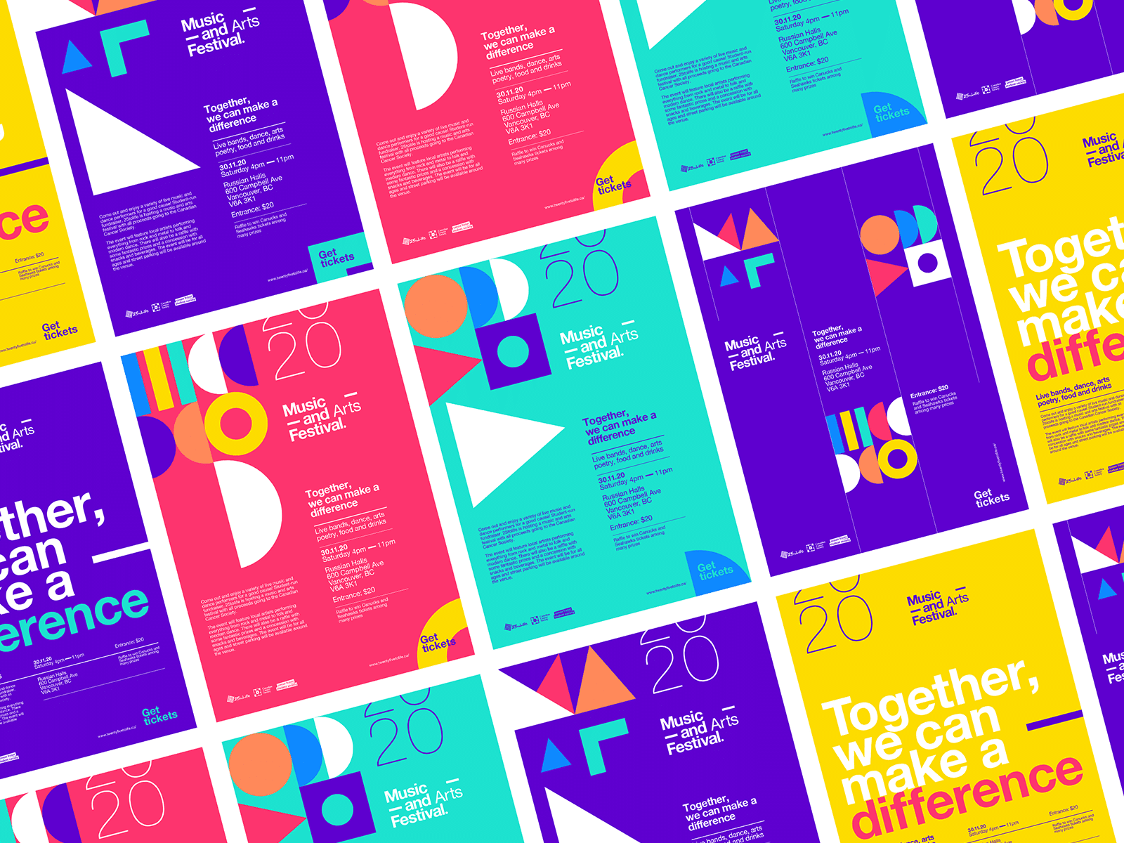
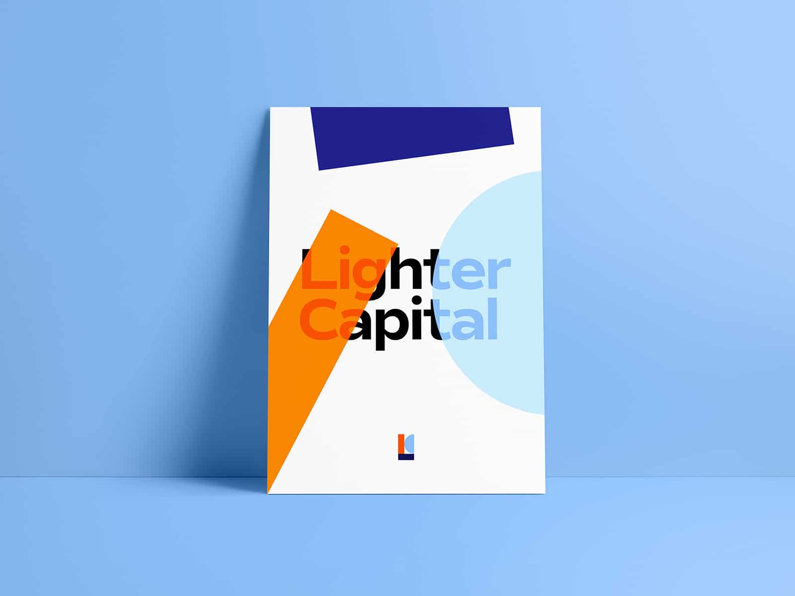
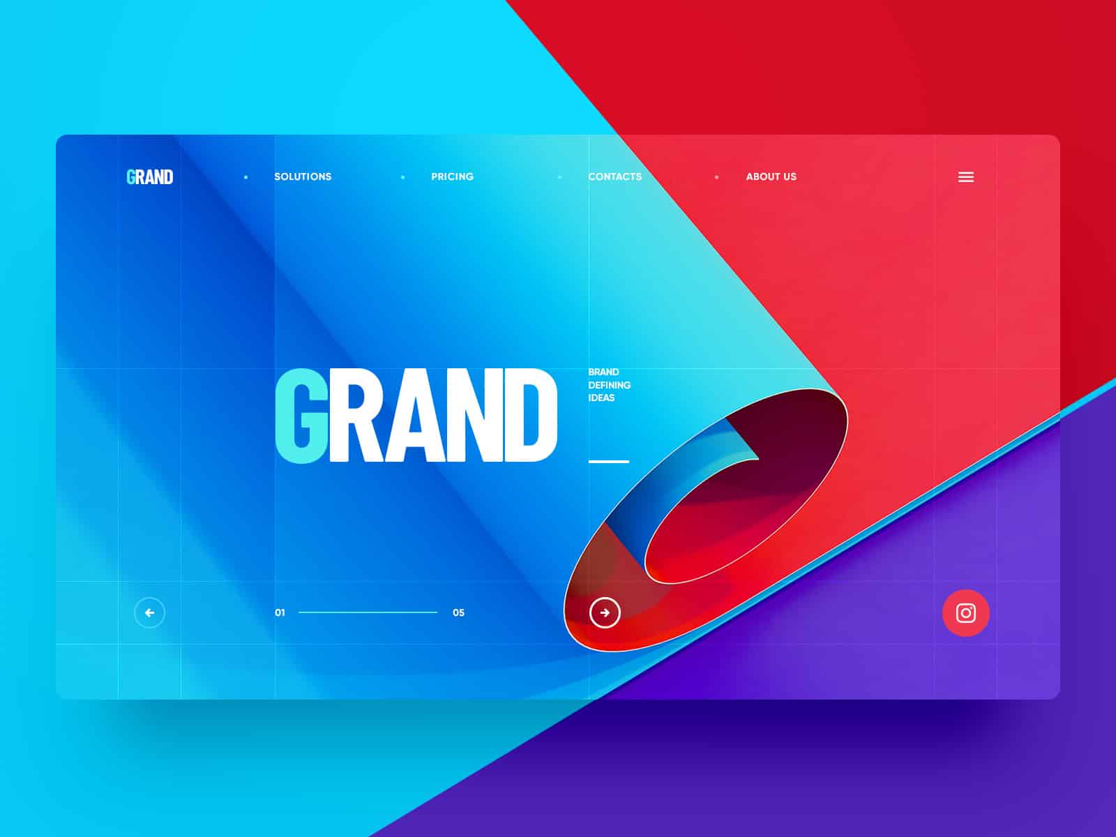
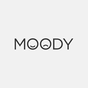
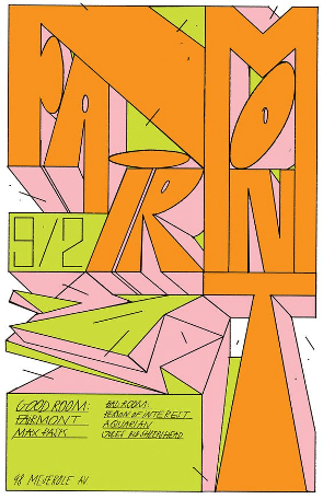
See how the text, colors, fonts, and different elements of each image makes you feel something different? That’s how typography can help brands establish unique personalities based on what they offer.
5. The Most Important Information Always Comes First
Some words and phrases will always be more important than others depending on the purpose of each piece. Making them stand out goes beyond bold fonts and highlights, though.
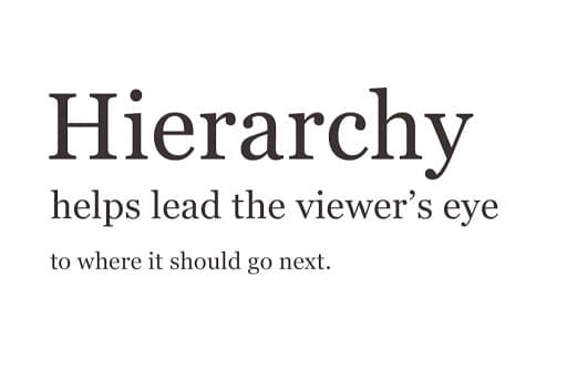
Prioritizing information has to do with how font size is varied throughout the typography design.
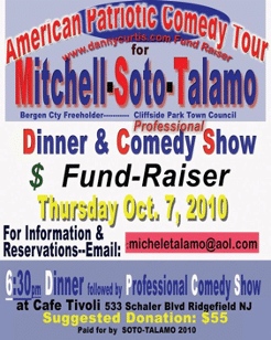
The following image perfectly explains the concept of hierarchy:
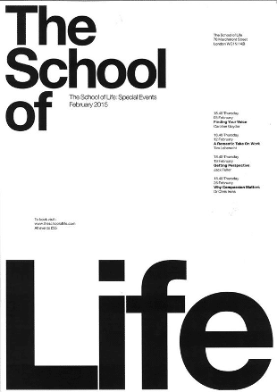
As a real-life example, check out the following poster. Pay attention to how you’ll look at the bigger text first, then the smaller text, and finally the smallest.
How to Avoid the Bad and the Ugly of Typography
You’ve seen examples of great typography. Now it’s time to look at a few examples of what to avoid.
Have you ever looked at a piece of graphic design and couldn’t even read what was written?
Or maybe, a visual element or two got on your nerves because the spacing was so bad.
Perhaps the entire thing was an overall confusing mess.
If you don’t feel like giving readers a headache, here are a few quick tips:
Don’t try to stuff a lot of information at once. If you have more than one point to make, use the hierarchy technique to organize your ideas.
Avoid using too many different fonts. Keep your choices to a maximum of three fonts, but if you can use only two, that’s even better. This prevents reader confusion.
Keep an eye on spacing and justification. If the spacing (kerning) between fonts doesn’t look harmonious, start again. For many people, bad kerning could go unnoticed, but for designers and observant people, it can be distressing.
Yes, typography is far more complicated than most people would imagine. It’s an art, one that may take years to master. But when done well, it creates brands, it grabs attention, and it conveys important messages in an artistic and unique way.


