


“Creative27 excelled in designing websites and logos for two nonprofits I’ve worked with, adapting to our pace with utmost professionalism. Their designs, praised for both aesthetics and user experience, never missed a deadline.”

“Creative27 excelled in designing websites and logos for two nonprofits I’ve worked with, adapting to our pace with utmost professionalism. Their designs, praised for both aesthetics and user experience, never missed a deadline.”

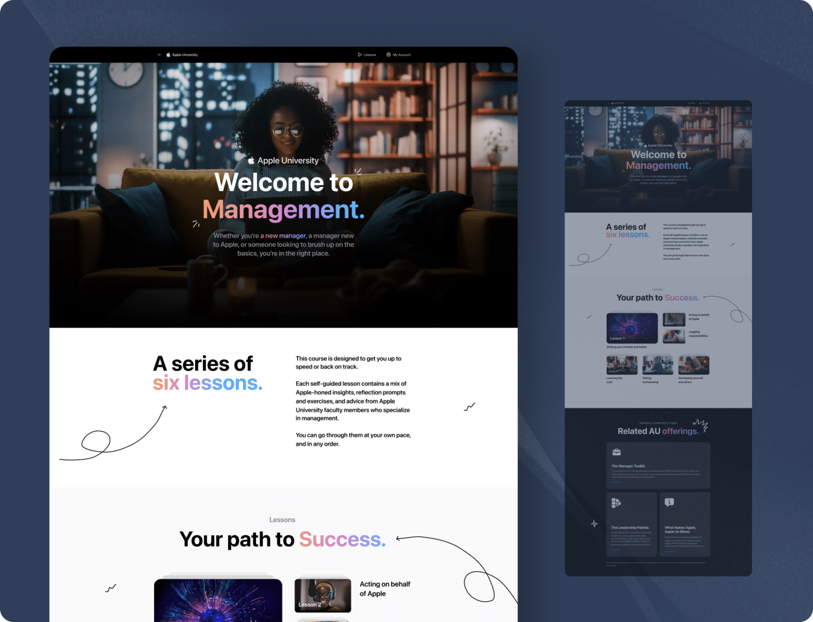
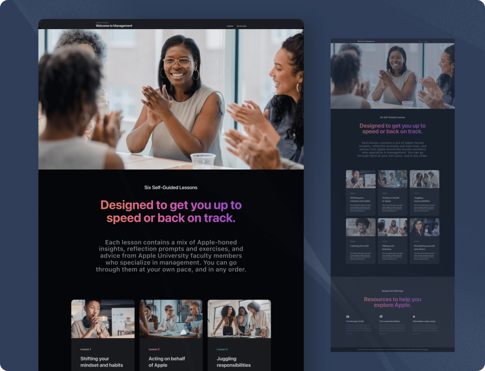
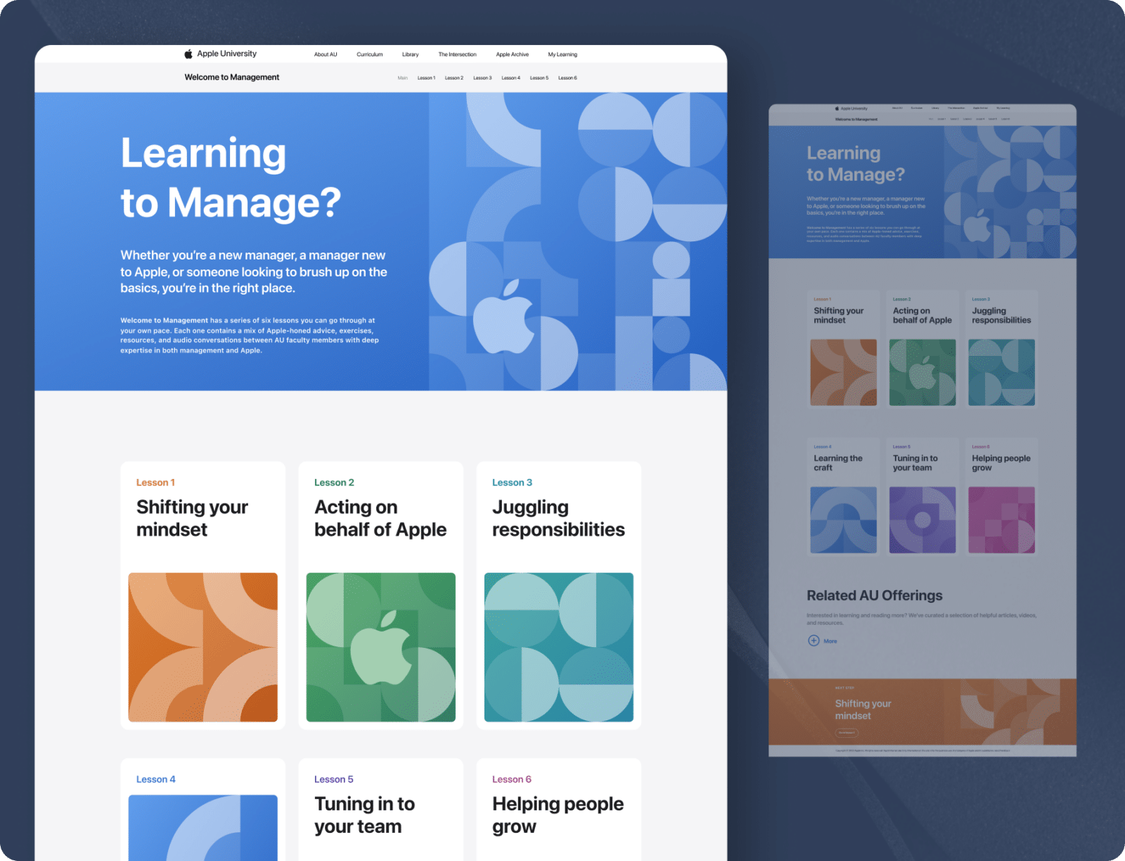
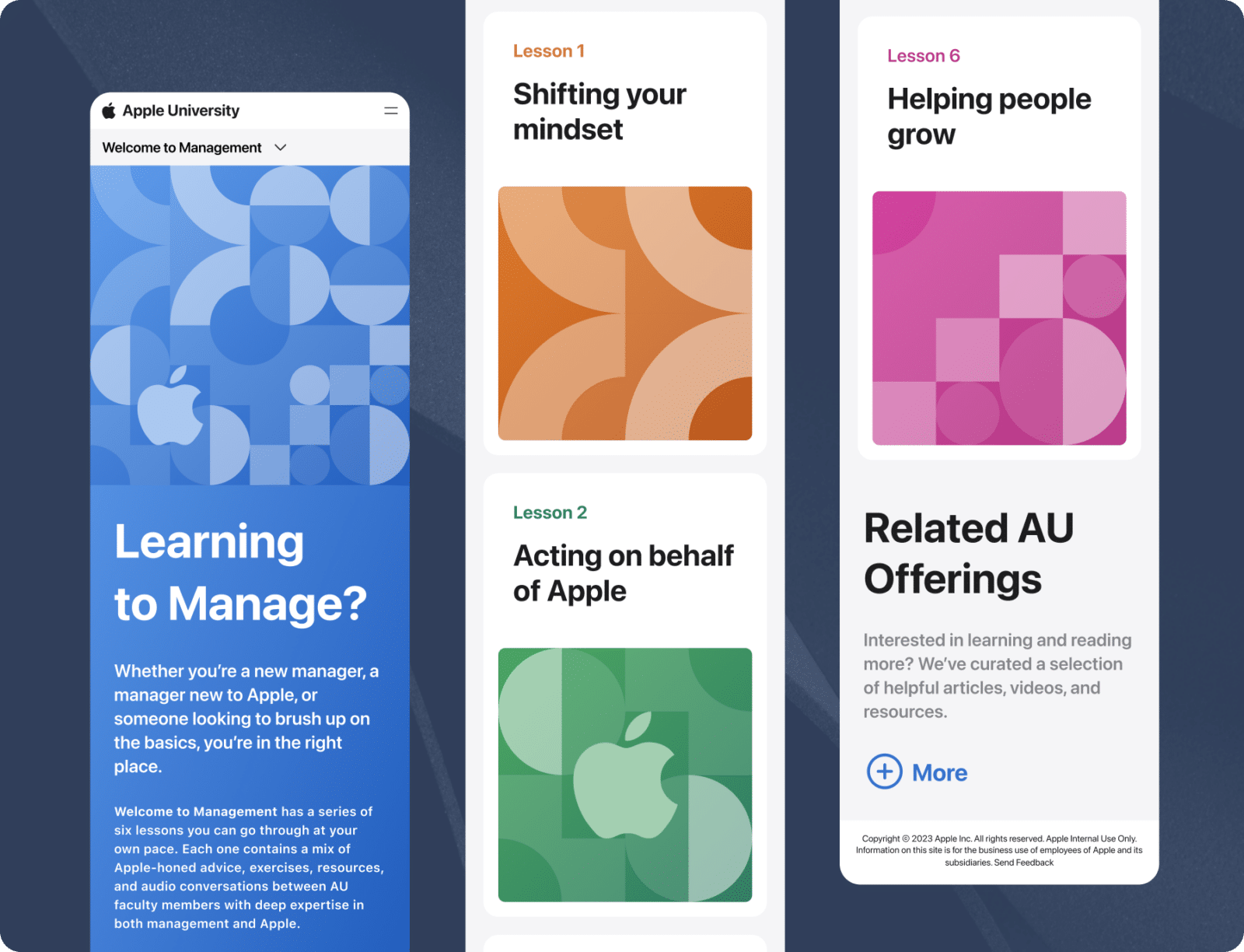
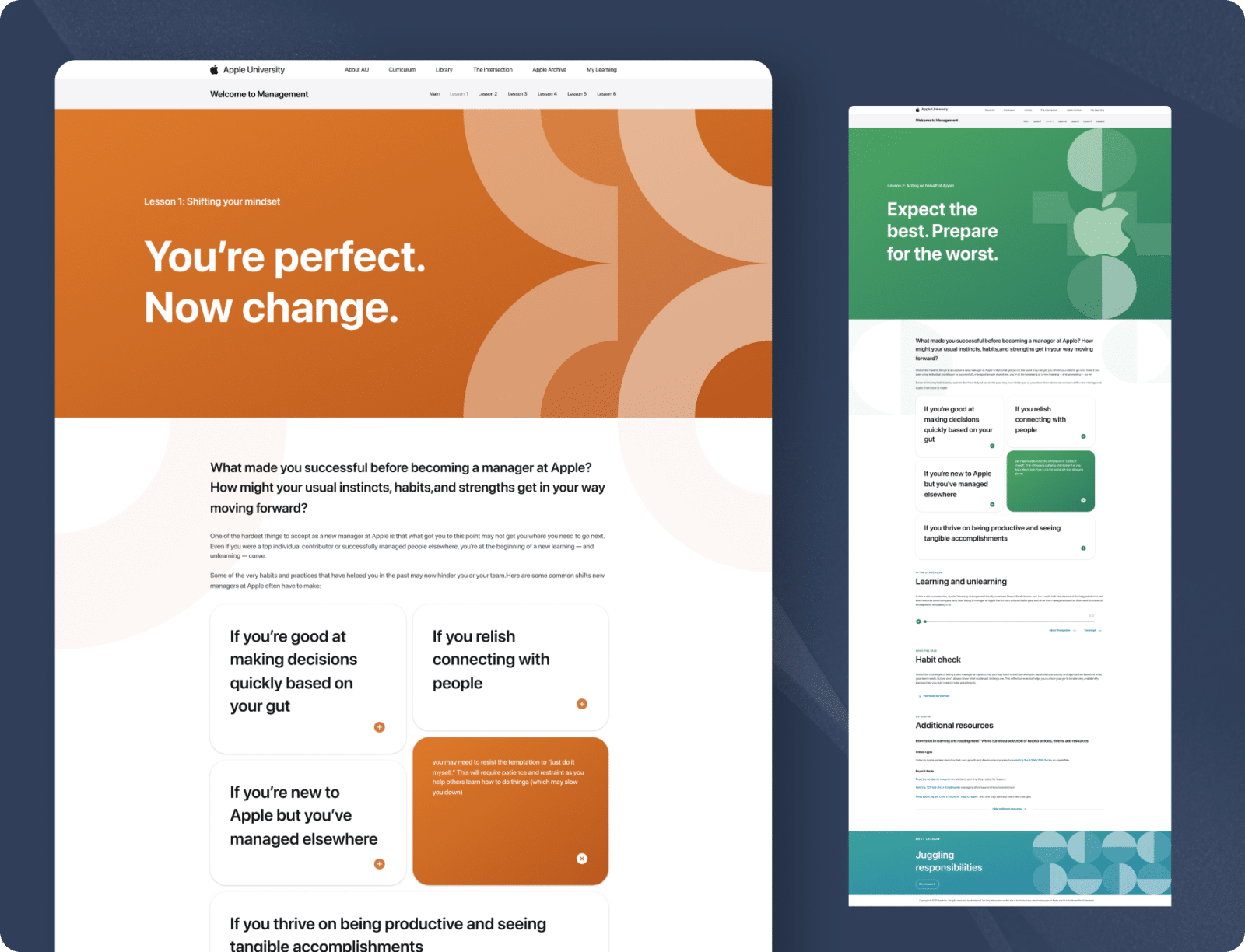
Creative27 excels in UI/UX design, efficiently handling complex projects with clear communication and a focus on modern, user-centric solutions.

Creative27 excels in UI/UX design, efficiently handling complex projects with clear communication and a focus on modern, user-centric solutions.

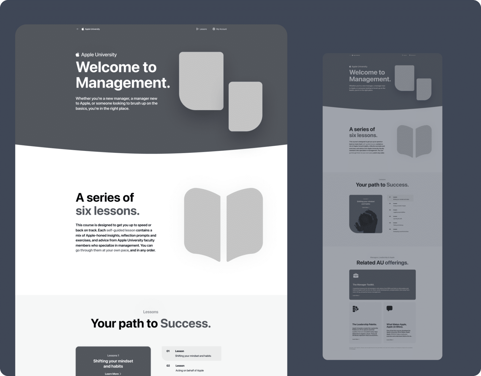
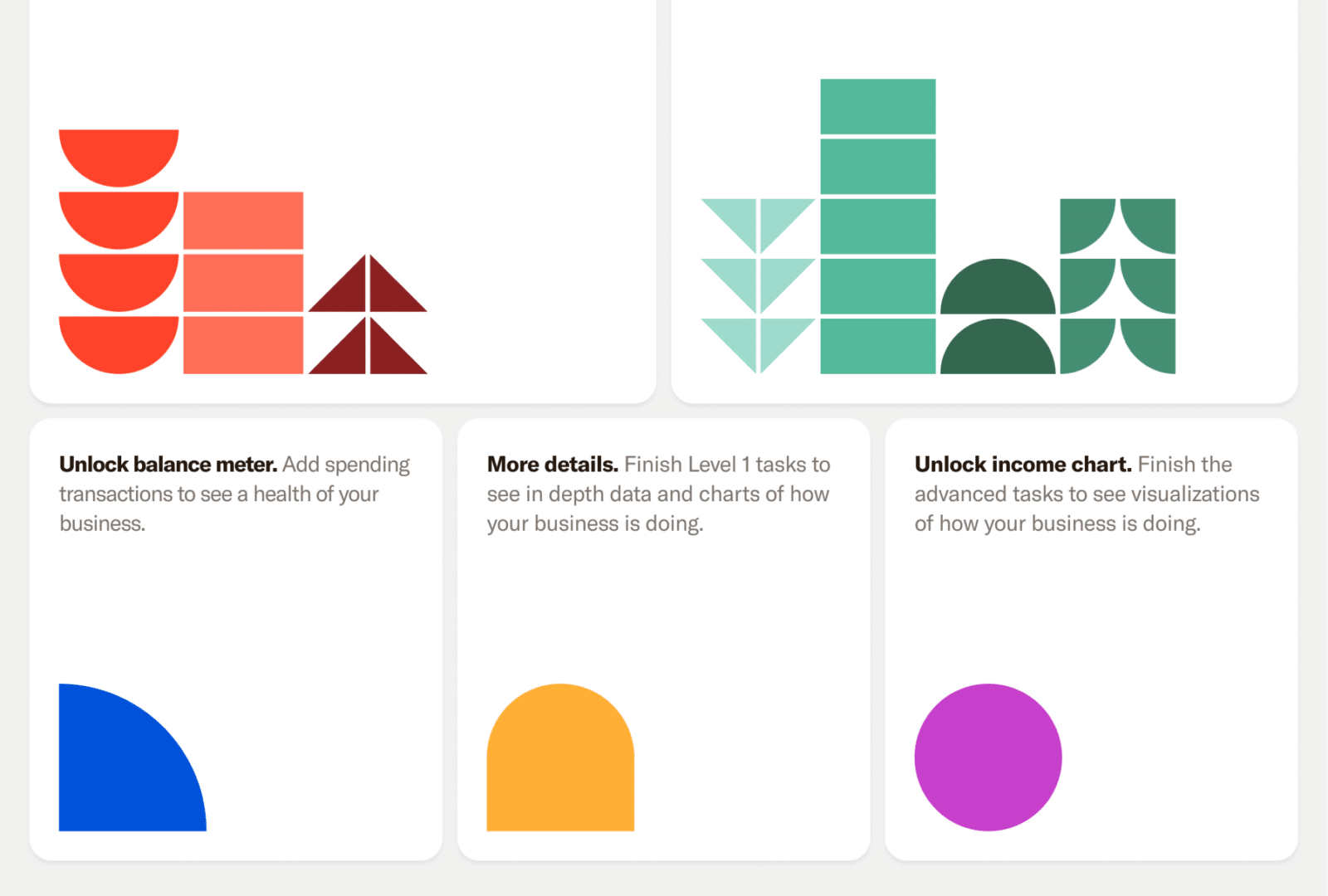
Creative27 excels in UX/UI design, turning basic ideas into polished, intuitive designs, as shown in their successful wine app project. Their skill in creating elegant solutions and maintaining composure under pressure marks them for future success.

Creative27 excels in UX/UI design, turning basic ideas into polished, intuitive designs, as shown in their successful wine app project. Their skill in creating elegant solutions and maintaining composure under pressure marks them for future success.

Creative27 exceeded expectations with market research and comparative analysis, maintaining high enthusiasm and partnership throughout our project’s development.

Creative27 exceeded expectations with market research and comparative analysis, maintaining high enthusiasm and partnership throughout our project’s development.
“Creative27 is a highly talented and creative digital agency. Their resourcefulness and team spirit make them an excellent asset to any company.”

“Creative27 is a highly talented and creative digital agency. Their resourcefulness and team spirit make them an excellent asset to any company.”

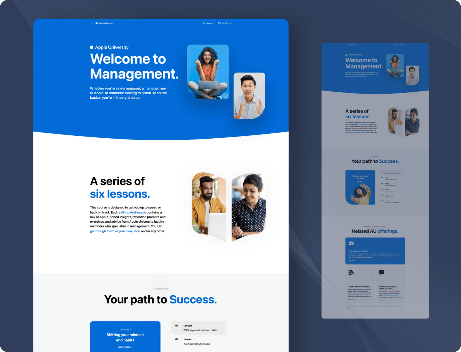
Creative27 is a top-tier UI/UX agency we’ve partnered with on key projects. Their creative output, professionalism, and ability to deliver beyond expectations have consistently resulted in beautiful work.

Creative27 is a top-tier UI/UX agency we’ve partnered with on key projects. Their creative output, professionalism, and ability to deliver beyond expectations have consistently resulted in beautiful work.
“We worked with the Creative27 team & had terrific results. Creative27 was able to help us visualize & understand our project with great clarity & efficiency. It’s why we chose to work with them again & again!”

“We worked with the Creative27 team & had terrific results. Creative27 was able to help us visualize & understand our project with great clarity & efficiency. It’s why we chose to work with them again & again!”
“Besides their excellent creative abilities, what sets Creative27 apart is their tight process, quick turnaround, and consistency in delivering good quality work.”

“Besides their excellent creative abilities, what sets Creative27 apart is their tight process, quick turnaround, and consistency in delivering good quality work.”
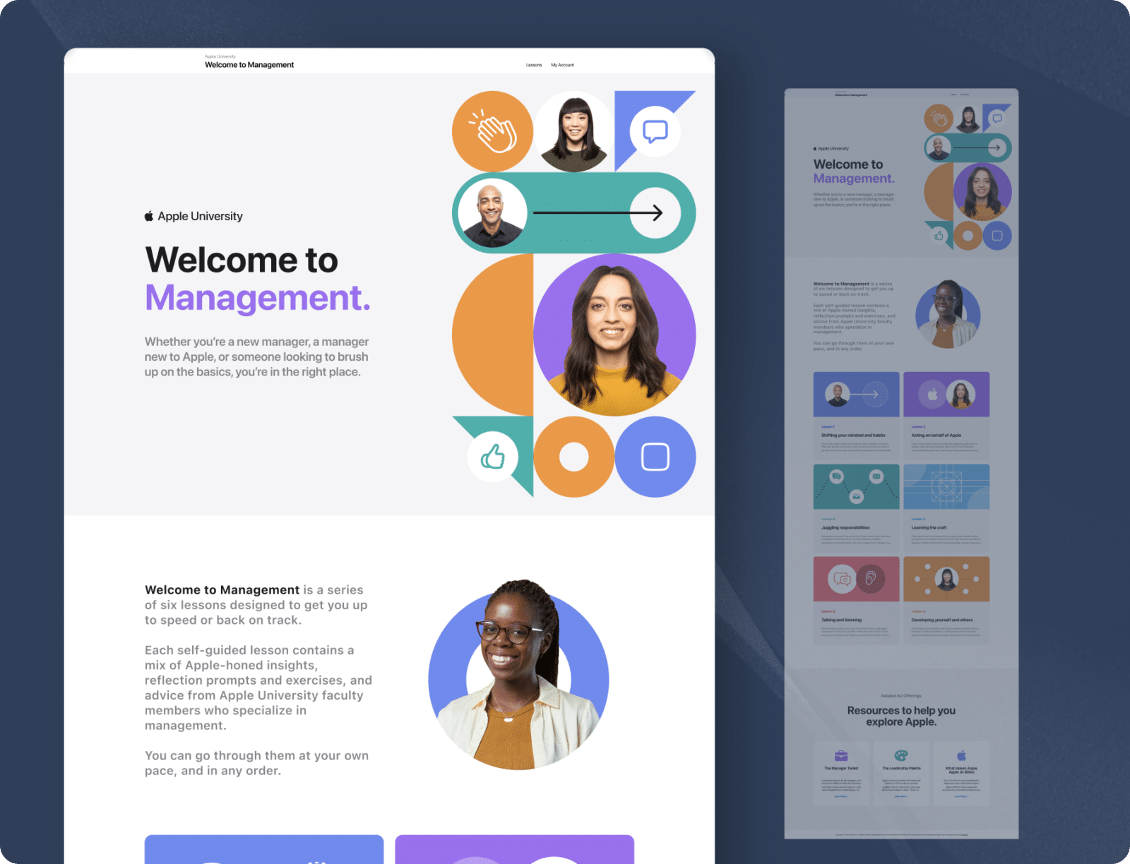
Working with Creative27 on our flagship product was a pleasure. Their artistic design and UX mastery, along with deep product design discussions, were invaluable. Thank you!

Working with Creative27 on our flagship product was a pleasure. Their artistic design and UX mastery, along with deep product design discussions, were invaluable. Thank you!