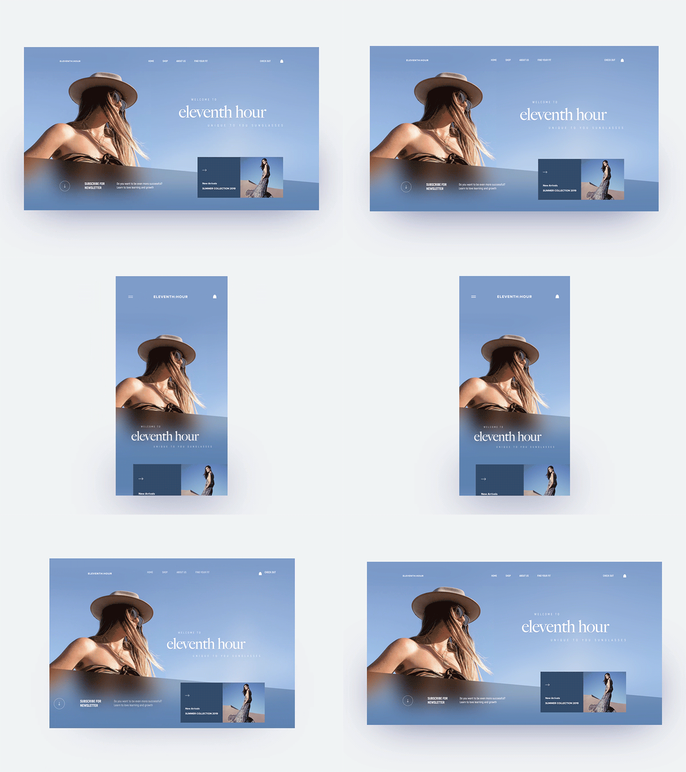
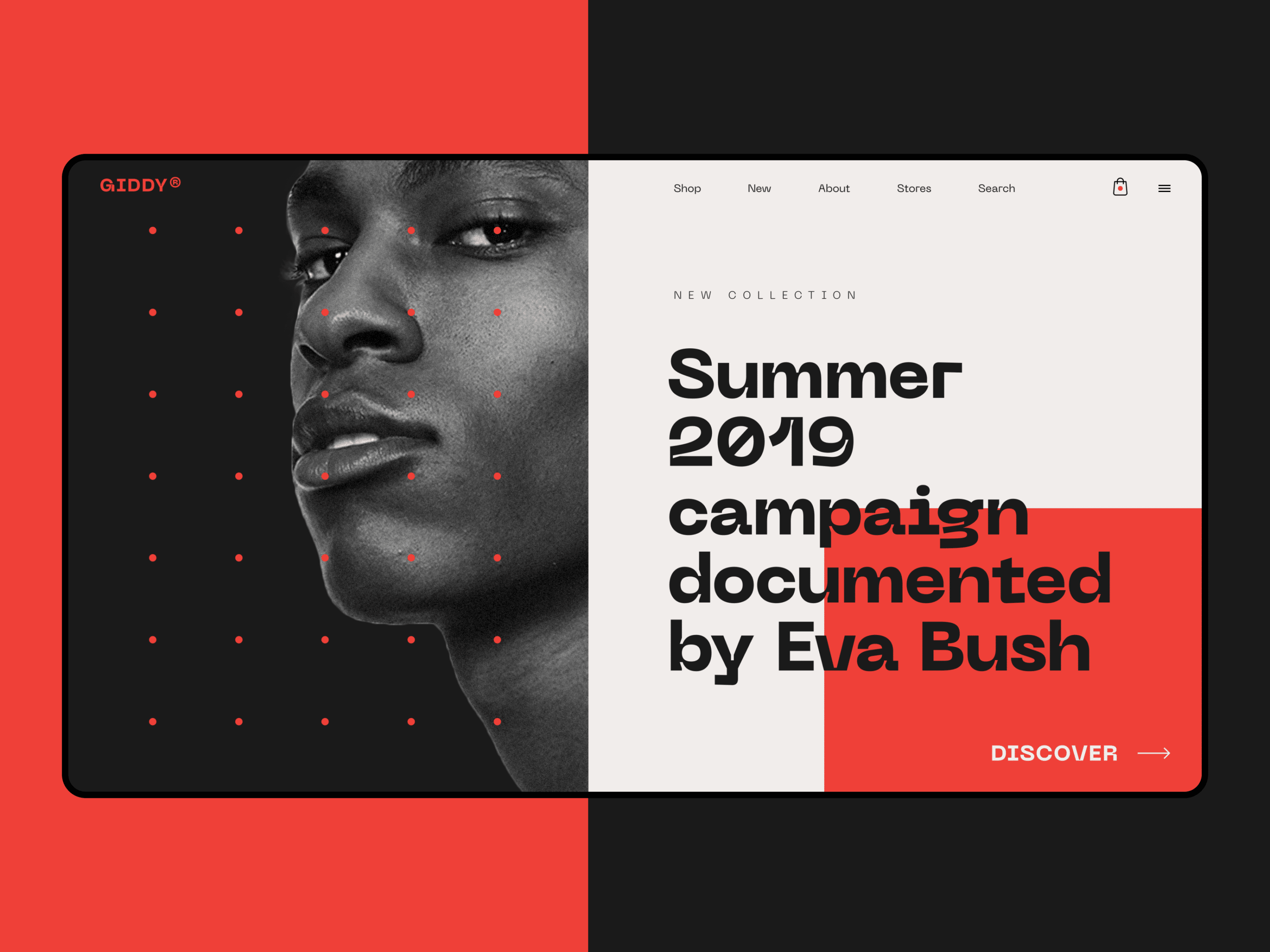
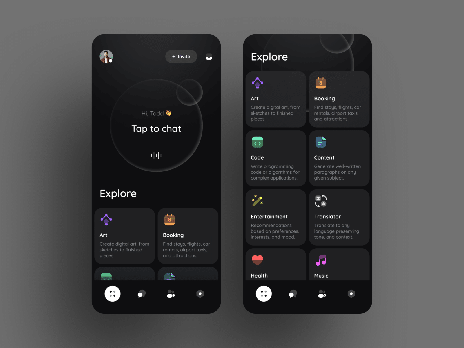
When it comes to creating an effective and appealing digital design layout, balance is critical. The aim is to create something which has its own sense of order and purpose and allows the user to find what they need. We know all about that here: Creative27 was awarded for creating captivating layouts across various apps.
It’s essential to consider the purpose of the page. While every project has its own specifications, you’ll find that there are two primary roles of digital layout design. The first is to convey information, and the second is to encourage the reader to understand.
The best way to do this is to create something which is aesthetically pleasing and communicates clearly.
The hard truth of design, especially designing for the web, is that 55% of users will give you just 15 seconds before they click away.
To improve your chances of keeping a customer on the page, we’ve compiled the 5 key elements to ensure you create a stunning and useful digital design layout every time.
1. Know Your Grid System
Far from being a digital concern, grid theory has applied since the early days of book creation. In its most simplistic form, a grid ensures that you are creating a visual balance.
A grid is made up of columns, alleys, and modules of information, and applying a grid helps you to see at a glance how the elements make up your specific page. Using a grid in your design makes it much easier to create connections between different parts of the page.
More than that, it will also help you clearly communicate what’s on the page, and make your design easier to understand. This is essential in easing the reader and allowing them to pay attention to the content.
While grid theory is as old as design, it also helps ensure that the pages you’re building are responsive to whatever screen your user will view. Understanding how your grid will look on different screen sizes is a great way to make sure that you’re not suffering from preventable mistakes, or alienating mobile users.
2. Pick a Focal Point
Design layout, just like fine art, can be inspired by following a few fundamental principles on the best way to draw your viewer.
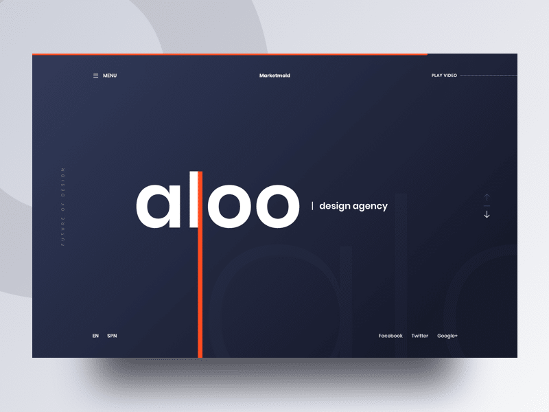
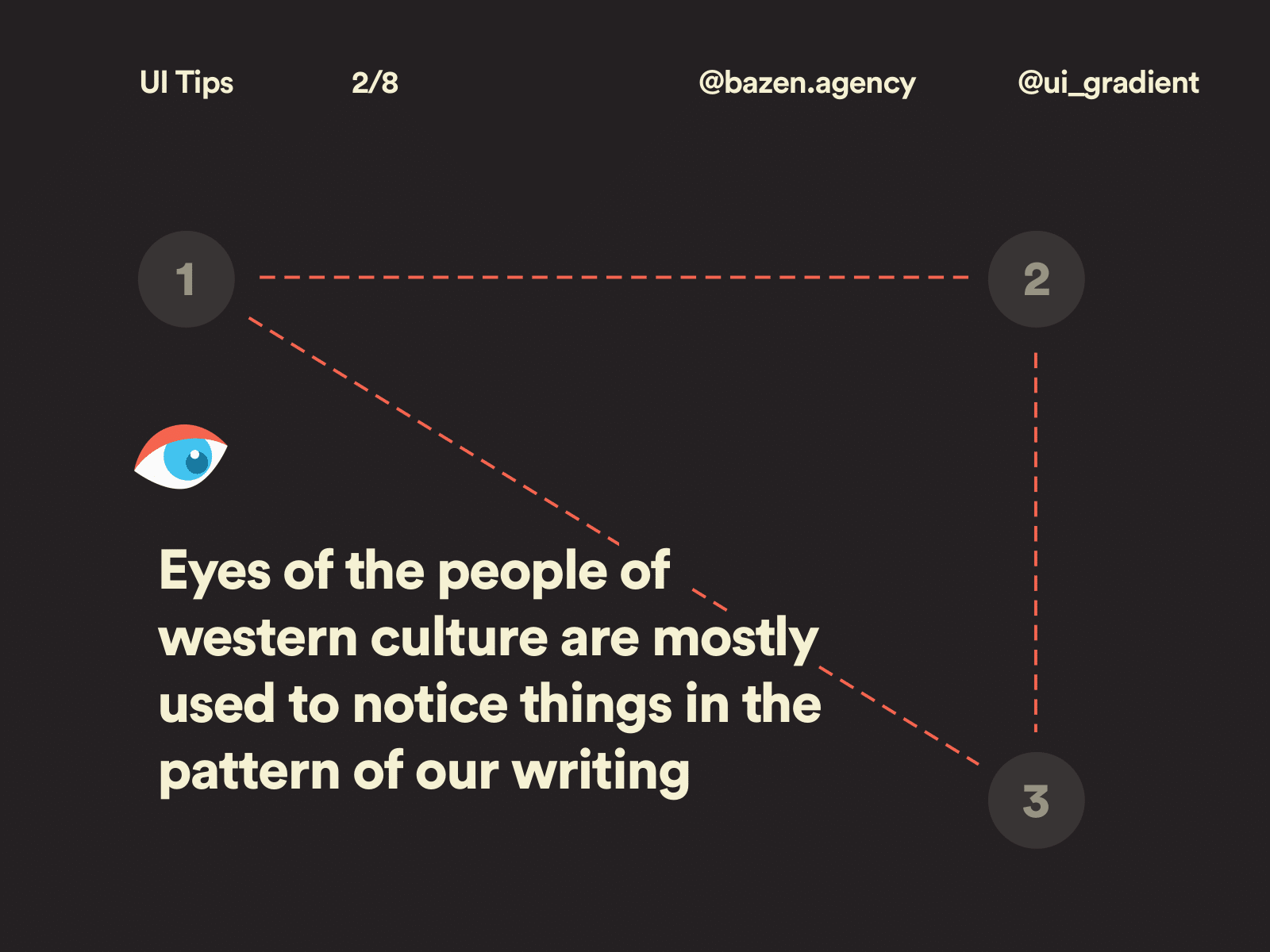
By choosing one simple focal point – perhaps one large image or a clear headline – you can simply convey a message to the viewer, which leads the reader into the content of the page.
You can also use elements of Gestalt Theory to group together relevant or linked things. Gestalt Theory relies upon creating a “unified whole” and highlights that proximities between blocks create a relationship between them.
The Rule of Thirds works as it sounds. Creating a grid of nine squares will show you how and where to align your crucial elements.
By itself, the rule of thirds can’t provide you with a magic balance. However, it can help you to establish a natural focal point as an anchor for the rest of your content.
The most typical approach to using the rule of thirds in digital design is to put the most significant elements of the page in the upper or lower thirds of the page, with the main focal point lining up with where the lines intersect.
3. Negative Space
Have you ever tried to pick out a single voice in a crowd of people cheering? Impossible, right?
Well, ignoring negative space does that to people viewing your design.
White space is vital to allow people to quickly skim and process what you’re showing them.
It’s also a great way to provide breathing space in walls of text, with images and blocks that can help to visually synthesize the message.
Lack of negative space is an issue that often signals an inexperienced designer. Instead of cramming everything into the page, use thirds’ rule to see where you can play with space. However, white space is most effective if you have a clearly defined structure to place it in – without this, it can seem arbitrary or chaotic.
4. Hierarchy
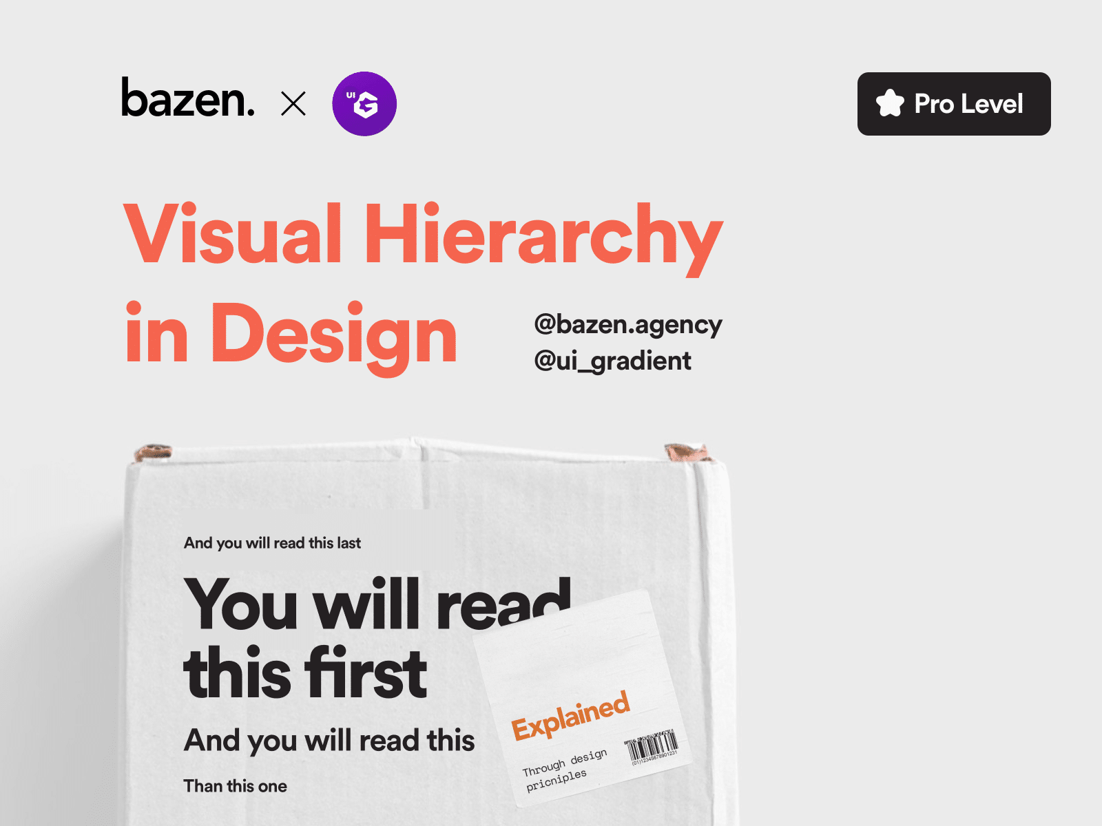
Ensuring that your page appeals to the logic of hierarchy will help you to achieve a sense of balance, and communicate clearly to your reader.
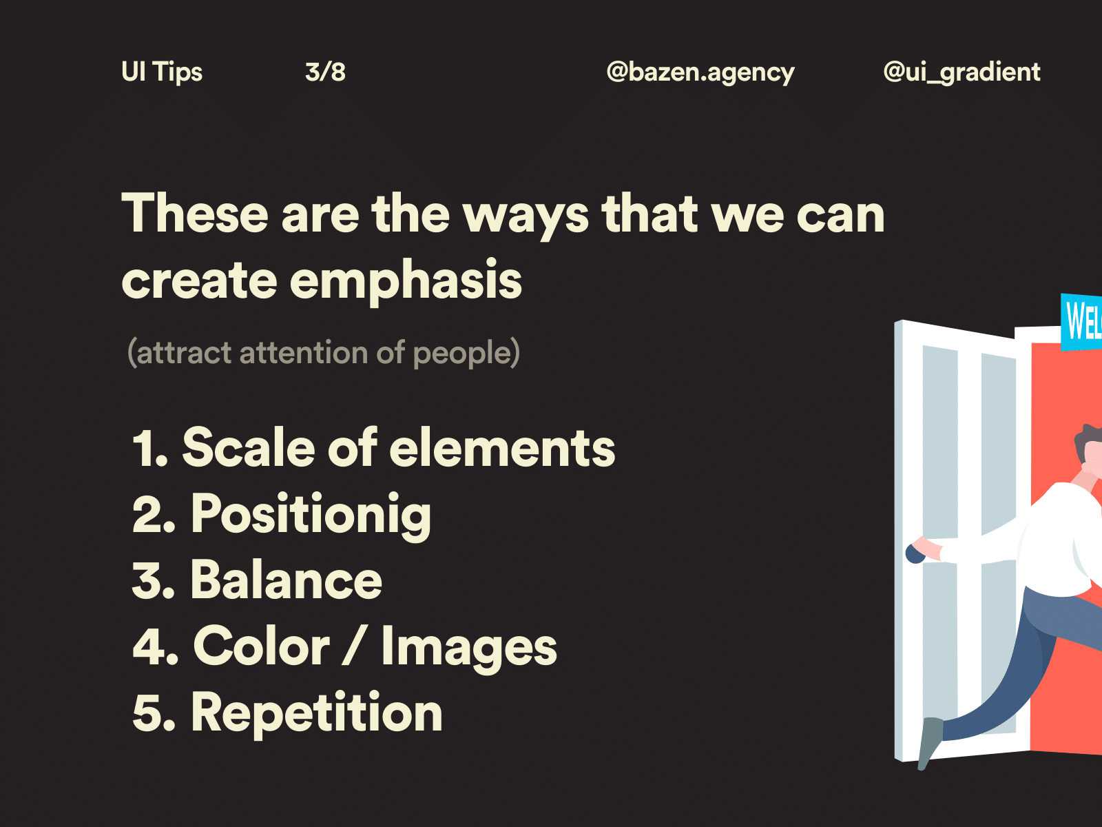
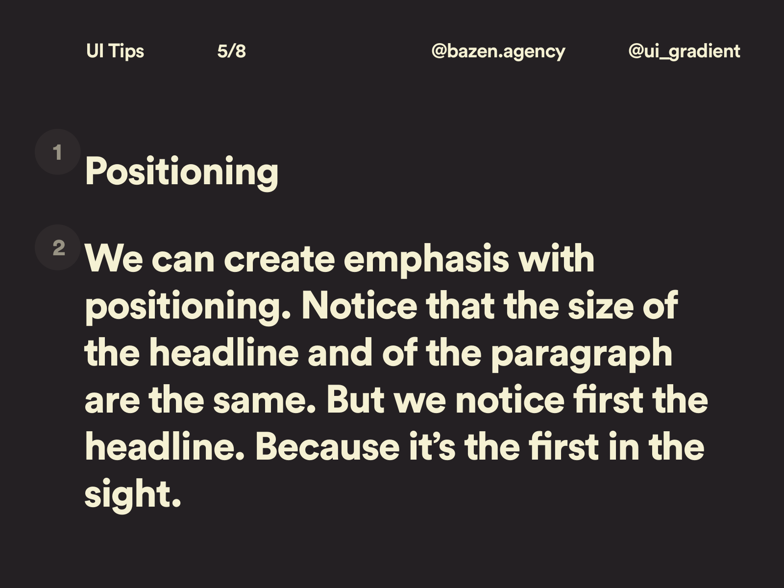
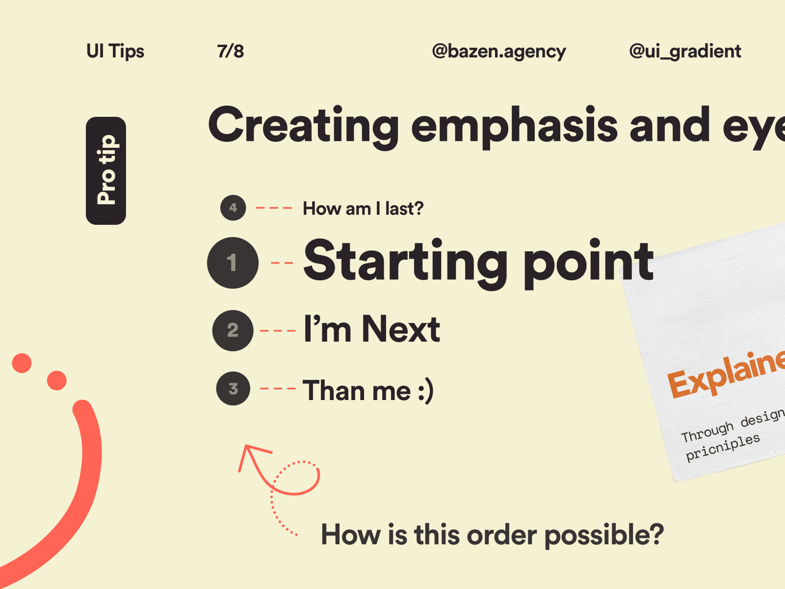
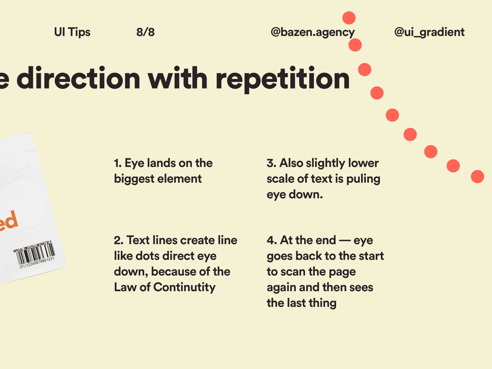
Just as an image will help draw a focal point, headlines can help to communicate a key message or purpose. They should always be more visually impressive than the body text content, as they will act as a hook for the content.
Consider making your essential instructions stand out so that people can understand what’s being conveyed before they’ve even particularly read the message.
5. Scale & Contrast
When working out how to showcase specific elements, scale and contrast are your best friends.
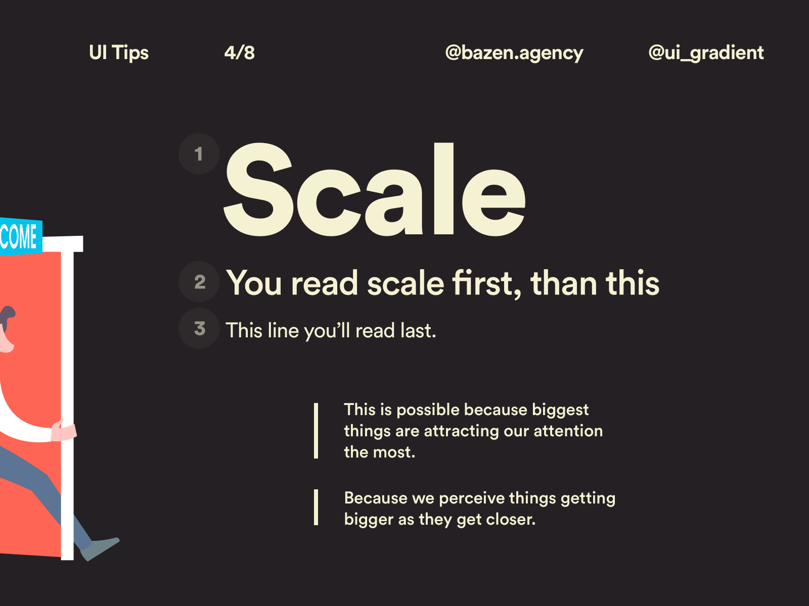
The law of scale, particularly when it comes to layout in digital design, is that the bigger it is, the more someone will be drawn to it. Increasing the scale of calls to action will increase the likelihood of somebody noticing it.
Utilizing scale in this way also establishes a sense of hierarchy and order which will be comfortable for the viewer. The aim is to have a holistic digital layout that works in harmony with itself and doesn’t throw the viewer out of their comfort zone.
However, implementing scale isn’t the only way that you can appeal to a page skimmer. If you prefer, using color and contrast can draw the eye towards one specific piece of information – ideally, the most essential pieces of information.
Creating Captivating Layouts at Creative27
Remember, the goal of effective digital layout design is to create a feeling of harmony and balance with the viewer. The more comfortable they are, the more likely you will get more than 15 seconds on the page.
These five elements work best when used together to establish a rhythm and flow of information that conveys a clear message without any distractions.


