Color is a crucial element in designing an app. Its importance goes way beyond what looks pretty or even what colors are flashy and draw attention.
Colors subconsciously give the viewer a lot of information about the app, even if they never read a word of text. Color is powerful and using the right colors can literally make the difference between a successful app and one that is a complete flop.
Read on to learn about the principles of color in app design.
What Is Color Psychology?
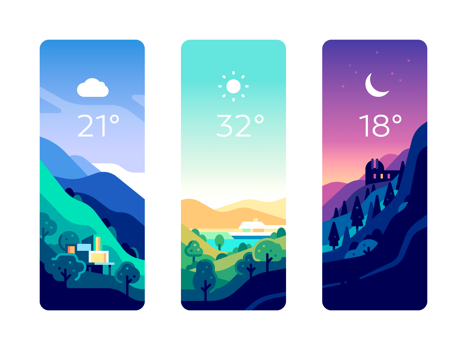
Different colors can actually have a profound impact on human mood and even behavior. This the idea behind many of the green and blue space initiatives in cities all over the globe. Green and blue make the viewer feel more calm and relaxed.
The effect is so profound on reducing stress (and other factors) that green spaces can actually help people live longer.
What does this mean for app design?
Well, color has an impact beyond just whether the viewer likes it or not, it affects how they feel. For example, shades of blue inspire a feeling of loyalty and reliability. Green inspires comfort and happiness. Yellow is associated with cheerfulness and stimulation. Red feels exciting and initiates desire.
But what about things that aren’t necessarily feelings? Do people tend to associate certain values with colors as well?
This survey asked people to pick the color they associated with a certain word. They found:
- Trust = blue (34% of respondents)
- Speed = red (76%)
- Cheap or inexpensive = orange (26%) and yellow (22%)
- High quality = black (43%)
- High tech = black (26%), blue (23%) and gray (23%)
- Reliable = blue (43%) and black (24%)
- Fun = orange (28%) and yellow (26%)
- Fear, terror = red (41%) and black (38%)
App designers would do well to keep these associations in mind when developing their apps. However, none of this is hard data that app developers absolutely must follow if they want their app to succeed. Rather they are guidelines developers can follow coupled with the other design principles discussed below.
Cultural Differences Around Colors
It is always crucially important to keep the app’s audience in mind when choosing colors. Not every culture views all colors the same way.
For example, in Western cultures, the color white tends to represent purity or innocence. However, in certain parts of Asia, white is reserved for mourning, bad luck, and death. Obviously, this could have a serious unintended consequence if not properly applied.
To that end, developers should be aware of their audience and choose colors accordingly, not an easy task in an ever more globalized society.
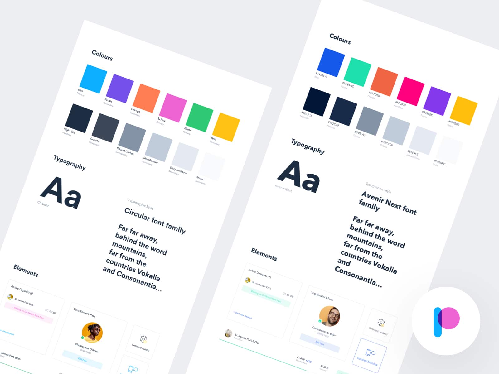
Choosing the Main Color Palette
App developers and companies alike should do careful research before settling on the main color palette for their brand. The most important thing is to consider the audience and what they wish to convey.
Blue is a popular color as it is associated with trust and reliability, but it is also becoming a little overused. Orange can be associated with cheapness, but also with fun. Red can be exciting and invigorating but also represent fear.
How you use the colors and the rest of your design will help mold the viewer’s perception. However, developers need to be aware of color associations and how their audience will subconsciously view the design to create a successful palette.
Color Harmony
Once app developers have settled on the main color, it’s time to choose the other colors. Using one color is simplistic and generally won’t be very eye-catching.
However, the colors chosen need to work together well. Clashing colors can make viewers feel uneasy or stressed and they may be less likely to click on the app icon just because of the crass colors.
Instead, app designers should seek to create a combination that is pleasing to the eye. One that will interest users and make them feel good about the app and thus lead them to try it out.
Here are a couple of basic principles designers can follow to create color harmony in their designs.
Monochromatic Colors
The first is to stick with the same color for the entire design, but use different shades. This adds interest without being overwhelming. It’s also hard to mess up, making it a popular choice.
Analogous Colors
Another popular choice is to use analogous colors. This scheme is also difficult to mess up, although developers do need to be aware of the vibrancy and strength of each color.
This method consists of using colors that are next to each other on the color wheel. For example, green and blues, or oranges and reds.
Complementary Colors
A complementary color scheme uses colors that are opposite from each other on the color wheel. For example, yellow and purple or blue and orange.
When using complementary colors, Designers must choose the shade and tone carefully. It is easy to create a visually jarring scheme if not done well.
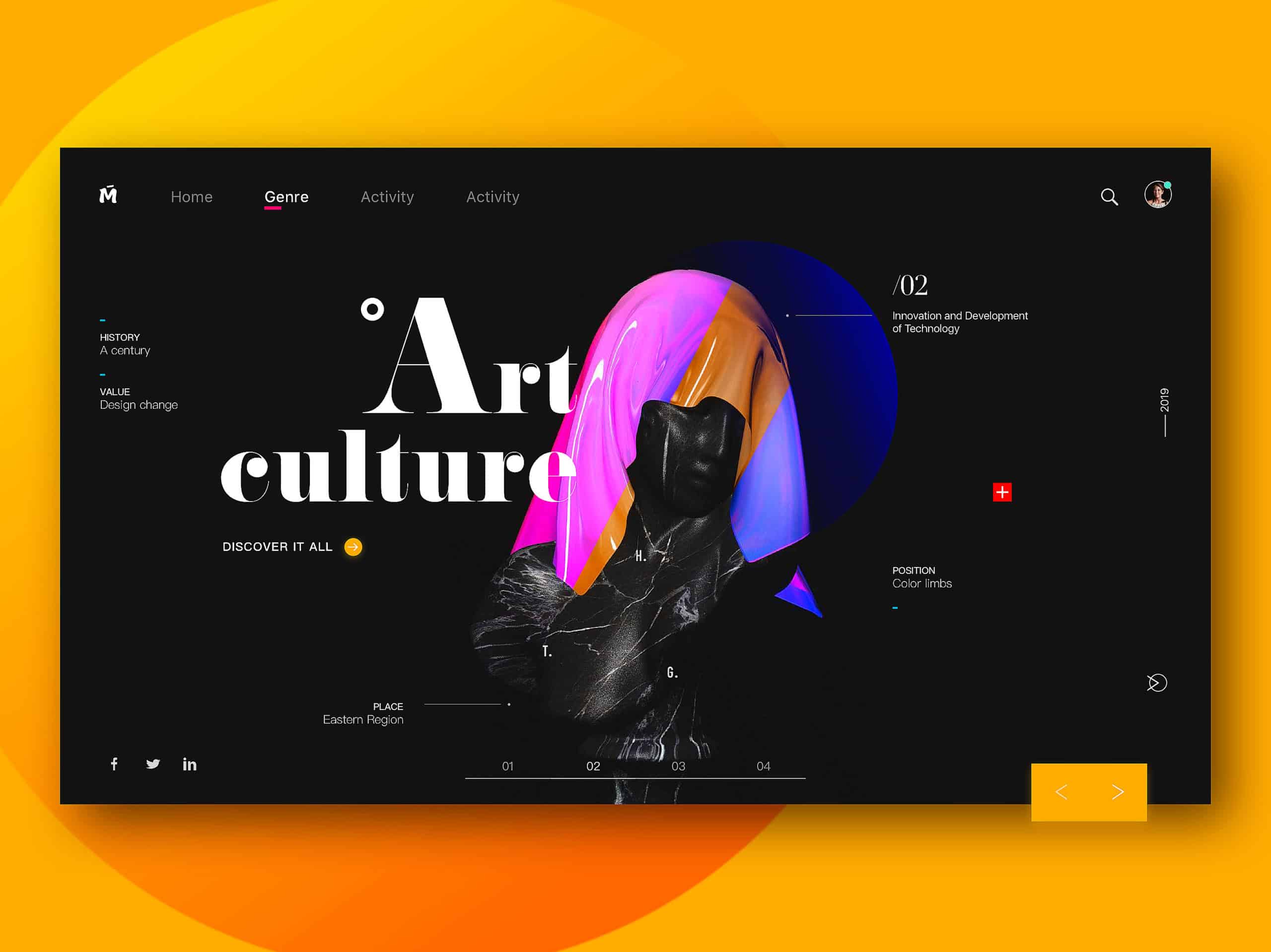
However, when done well, complementary colors can make an app design really pop and stand out amidst a sea of other, less-intriguing app icons. This can make users more likely to choose the app over others promising a similar function.
Split-Complementary Colors
This method is a bit more complex but can make for some compelling results. It employs using three colors, one color and the two adjacent colors to its complementary color. For example, begin with purple and add orange and green.
Designers have to work carefully with this method, the wrong combination will turn the design from interesting to clashing.
The Right App Design Colors
All in all the world of colors in app design is very complex. No one set of colors will appeal to all audiences, nor will they be appropriate for all brands. However, choosing the right colors can absolutely mean the difference between a highly successful app and one that is only so-so.
To learn more about app design or for help creating an incredible design for your app, feel free to contact us here at Creative 27!


