Revitalizing Chase’s Mobile Experience:
When User-Friendliness Meets Innovation

Summary
Chase Bank’s mobile app, beloved by 20 million users, faced a glaring conundrum: popularity didn’t translate to satisfaction. As users grappled with a maze of features and a UI that seemed more like a labyrinth, Chase aimed to turn the tide.
Cue the redesign – a project where usability took center stage, driven by insightful user feedback and a goal to streamline a bustling ecosystem.
Roles
User Experience Design
User Interface Design

Challenge
Despite being a banking juggernaut with over 20 million app users, Chase grappled with a slew of user complaints. Critical account information played hide-and-seek, accessibility seemed like an afterthought, and navigating the myriad services felt like a herculean task. To add to the woes, several features would lead users astray, prompting them to re-enter the app through a less-than-friendly interface. It wasn’t just about an overhaul; it was about reinventing user interaction while keeping Chase’s essence intact.
Solution
Armed with a trove of user feedback and a penchant for innovation, we embarked on the journey to reshape Chase’s mobile landscape. The strategy was straightforward – prioritize, test, refine, and repeat. By introducing incremental changes backed by relentless usability testing, the UX underwent a complete metamorphosis. Meanwhile, the UI received a fresh facelift, maintaining brand integrity. This rejuvenated approach didn’t just breathe new life into the app but also bolstered user satisfaction, proving that sometimes, simplicity truly is the ultimate sophistication.
User Experience Design
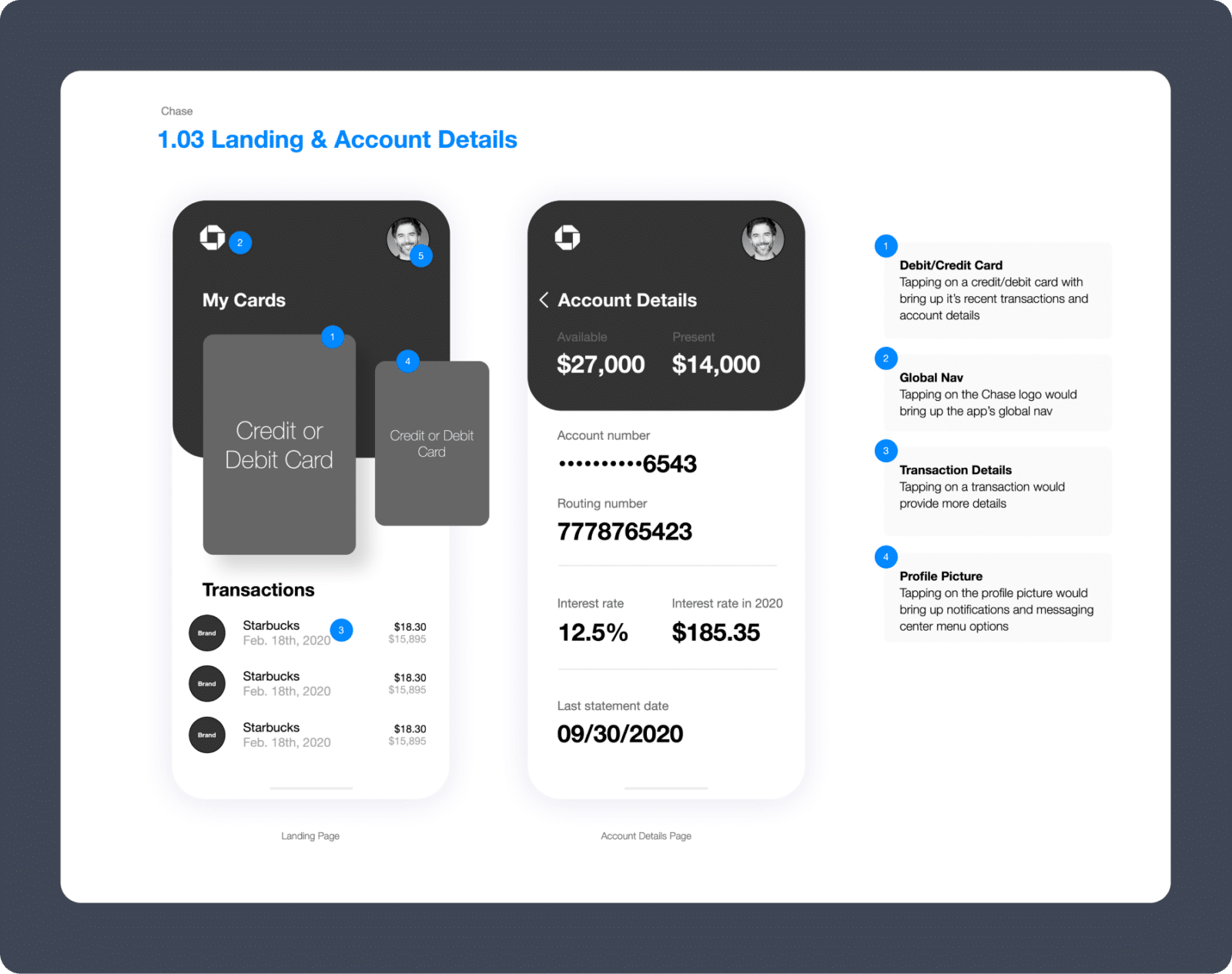
Navigating user feedback felt like decoding a treasure map. With each insight, our path sharpened. Initial sketches were our starting point, swiftly evolving into precise wireframes.
The north star?
Effortless user navigation. We meticulously orchestrated data to ensure a fluid and intuitive journey. In the vast realm of digital banking, we believe the user should always be the maestro.


User Interface Design: Responsive
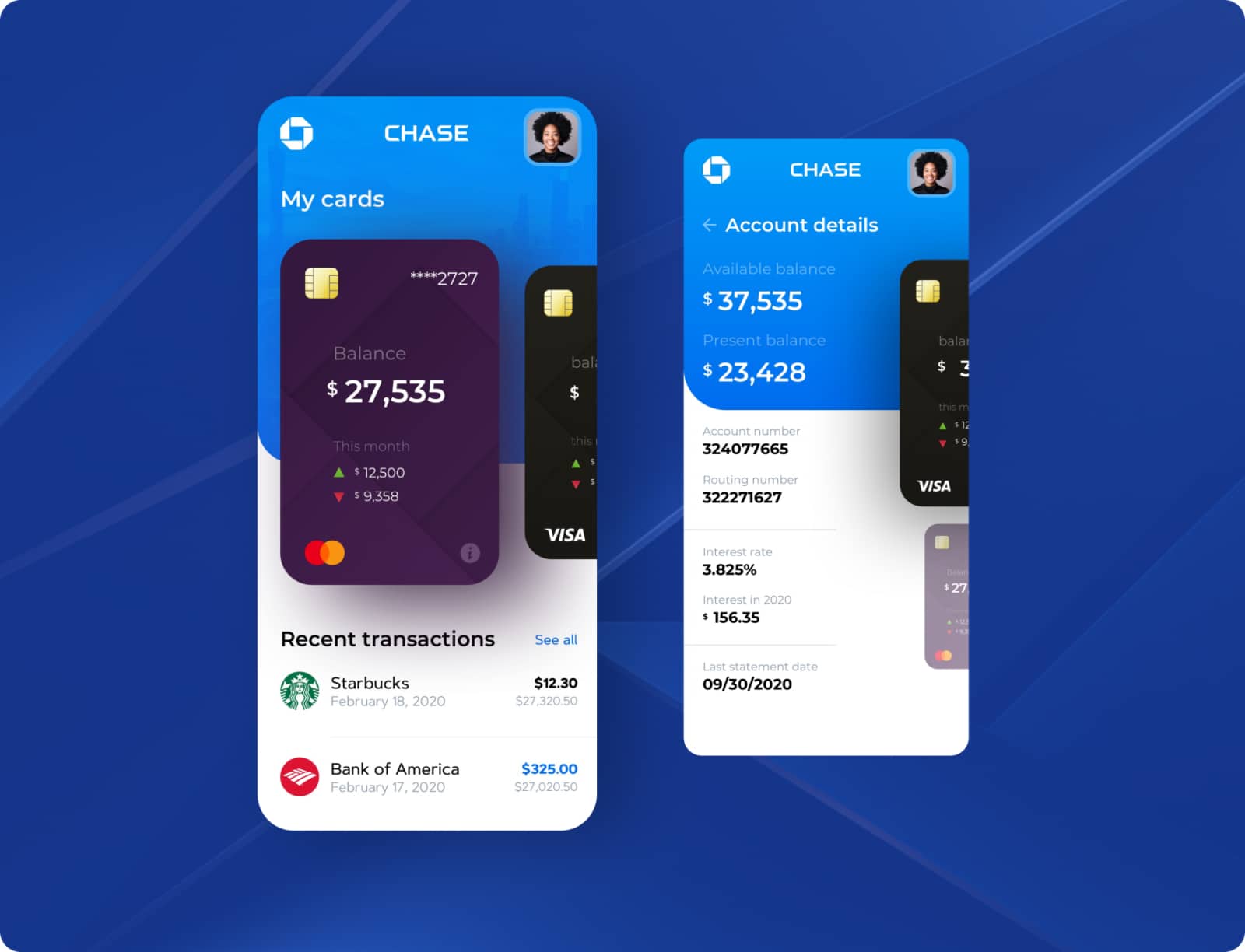
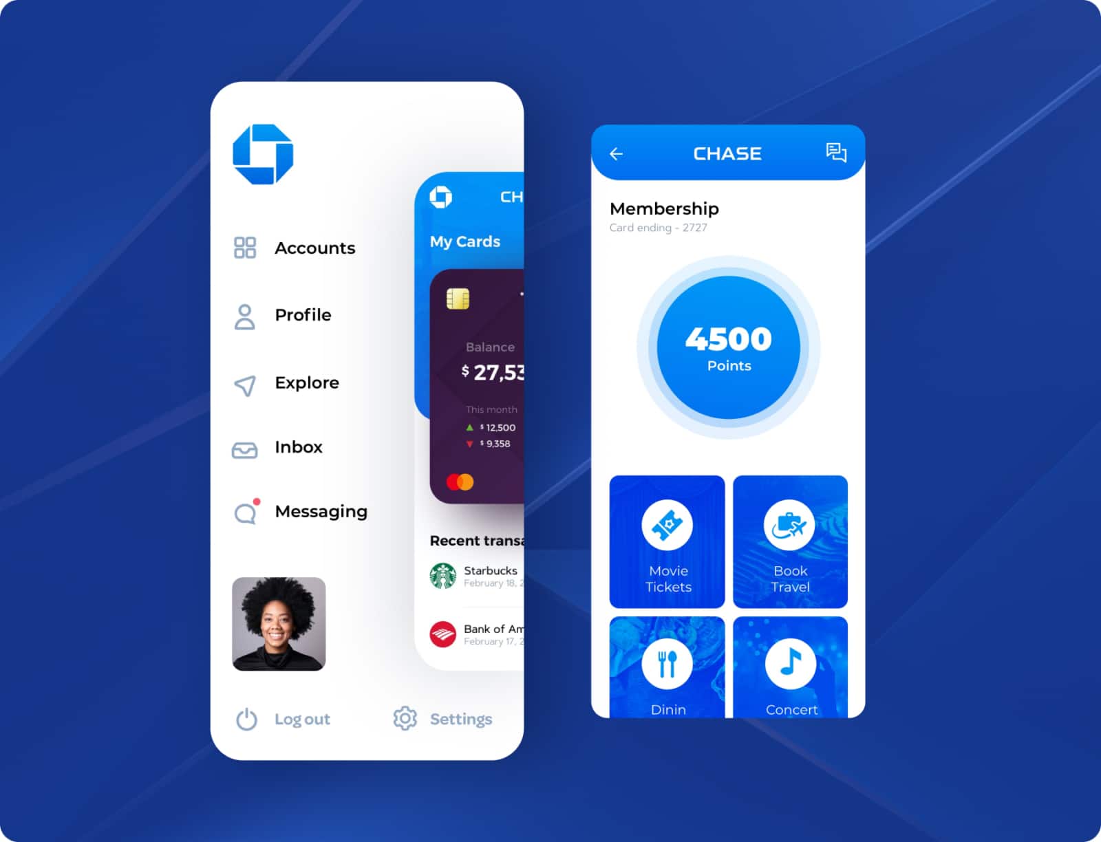
Blending updated UX with Chase’s brand identity was a tightrope walk. Our mission? Maintain brand consistency while streamlining the interface. We stripped away the non-essentials to craft a familiar yet fresh experience.
The outcome: A user-friendly digital space that welcomes both new and existing customers without diluting the brand’s essence.


Who we impress
Transforming bold visions into digital excellence, as reflected in testimonials from Samsung, Apple, T-Mobile, and more.
“Creative27 excelled in designing websites and logos for two nonprofits I’ve worked with, adapting to our pace with utmost professionalism. Their designs, praised for both aesthetics and user experience, never missed a deadline.”

“Creative27 excelled in designing websites and logos for two nonprofits I’ve worked with, adapting to our pace with utmost professionalism. Their designs, praised for both aesthetics and user experience, never missed a deadline.”

Creative27 excels in UI/UX design, efficiently handling complex projects with clear communication and a focus on modern, user-centric solutions.

Creative27 excels in UI/UX design, efficiently handling complex projects with clear communication and a focus on modern, user-centric solutions.

Creative27 excels in UX/UI design, turning basic ideas into polished, intuitive designs, as shown in their successful wine app project. Their skill in creating elegant solutions and maintaining composure under pressure marks them for future success.

Creative27 excels in UX/UI design, turning basic ideas into polished, intuitive designs, as shown in their successful wine app project. Their skill in creating elegant solutions and maintaining composure under pressure marks them for future success.

Creative27 exceeded expectations with market research and comparative analysis, maintaining high enthusiasm and partnership throughout our project’s development.

Creative27 exceeded expectations with market research and comparative analysis, maintaining high enthusiasm and partnership throughout our project’s development.
“Creative27 is a highly talented and creative digital agency. Their resourcefulness and team spirit make them an excellent asset to any company.”

“Creative27 is a highly talented and creative digital agency. Their resourcefulness and team spirit make them an excellent asset to any company.”

Creative27 is a top-tier UI/UX agency we’ve partnered with on key projects. Their creative output, professionalism, and ability to deliver beyond expectations have consistently resulted in beautiful work.

Creative27 is a top-tier UI/UX agency we’ve partnered with on key projects. Their creative output, professionalism, and ability to deliver beyond expectations have consistently resulted in beautiful work.
“We worked with the Creative27 team & had terrific results. Creative27 was able to help us visualize & understand our project with great clarity & efficiency. It’s why we chose to work with them again & again!”

“We worked with the Creative27 team & had terrific results. Creative27 was able to help us visualize & understand our project with great clarity & efficiency. It’s why we chose to work with them again & again!”
“Besides their excellent creative abilities, what sets Creative27 apart is their tight process, quick turnaround, and consistency in delivering good quality work.”

“Besides their excellent creative abilities, what sets Creative27 apart is their tight process, quick turnaround, and consistency in delivering good quality work.”
Working with Creative27 on our flagship product was a pleasure. Their artistic design and UX mastery, along with deep product design discussions, were invaluable. Thank you!

Working with Creative27 on our flagship product was a pleasure. Their artistic design and UX mastery, along with deep product design discussions, were invaluable. Thank you!
Find out how we can put solutions like these work for you.
Click, submit, and consider us talking. 24 hours max.


