In the fast-paced world of digital design and development, brand alignment is essential for standing out and making a lasting impact. At Creative27, we excel at integrating client brand identity into every phase of our projects, ensuring each digital product is not only visually appealing but also resonates deeply with the target audience. Here’s a closer look at our process and some success stories where our approach has driven customer engagement and business growth.
The Creative27 Process: Blending Brand with Design
1. Diving Deep: Research and Strategy
Every successful project begins with thorough research. We dive into understanding the client’s brand, values, and audience through a meticulous and multi-faceted approach:
- Quantitative and Qualitative Research: We collect data through surveys, focus groups, and market analysis. This helps us understand market trends, consumer preferences, and the competitive landscape. By combining numerical data (quantitative) with descriptive insights (qualitative), we gain a holistic view of the brand’s positioning and potential areas for growth.
- Brand Workshops and Stakeholder Interviews: We conduct workshops and interviews with key stakeholders to gather insights directly from those who know the brand best. These sessions help us understand the brand’s mission, vision, and unique value propositions, ensuring that our design efforts are perfectly aligned with the client’s goals.
- Competitor Analysis: We analyze competitors to identify strengths, weaknesses, opportunities, and threats. This helps us position our clients’ brand more effectively within the market and discover opportunities for differentiation.
- Customer Journey Mapping: By mapping out the customer journey, we identify key touchpoints and interactions that influence the customer’s perception of the brand. This process ensures that every stage of the customer experience is thoughtfully designed to reinforce the brand’s identity.
- Empathy Maps and User Personas: Creating empathy maps and user personas allows us to capture the target audience’s needs, behaviors, and pain points. This deep understanding of the user helps us design experiences that are both engaging and brand-aligned.
This foundational knowledge allows us to create digital experiences that are deeply aligned with the brand’s identity.
2. Crafting Experiences: User Experience (UX) Design

Next, we focus on designing user experiences that are intuitive and brand-consistent using Figma. Our UX design process includes several key components to ensure that the end product is both user-friendly and brand-aligned:
- Information Architecture: We start by organizing and structuring the content in a way that reflects the brand’s voice and ensures easy navigation. This involves creating site maps and organizing content hierarchies to make sure that users can find what they need quickly and easily.
- User Journeys: Mapping user journeys allows us to understand how users will interact with the product from start to finish. By identifying key touchpoints and potential pain points, we ensure that every interaction is smooth and aligned with the brand’s goals. This process helps us design a flow that keeps users engaged and reduces friction.
- Wireframes: Developing wireframes using Figma serves as the blueprint for the entire project. These low-fidelity sketches outline the structure and functionality of each screen, ensuring that every element aligns with brand expectations before moving on to more detailed design work.
- Prototyping: With Figma, we create interactive prototypes that allow stakeholders to experience the product in a near-final form. This step is crucial for visualizing the flow and functionality of the product, making it easier to identify any areas that need refinement.
- Usability Testing: Conducting usability tests is a critical step in our UX design process. We test our designs with real users to gather feedback on usability and functionality. This iterative process ensures that the design not only meets user needs but also stays true to the brand. By observing users as they interact with the product, we can make informed decisions about necessary adjustments.
- Accessibility Considerations: We prioritize accessibility to ensure that our designs are inclusive and usable by as many people as possible. This includes considering color contrast, font sizes, and navigation options that accommodate users with different needs and abilities.
By combining these elements, we create user experiences that are not only functional and user-friendly but also deeply aligned with the client’s brand identity.
3. Bringing Brands to Life: User Interface (UI) Design

The UI design phase is where the brand’s visual identity shines through Figma:
- Moodboards: Exploring visual directions through curated moodboards.
- Style Guides: Creating comprehensive style guides that outline typography, color schemes, and other visual elements.
- Design Systems: Ensuring a cohesive look and feel across all digital touchpoints through robust design systems.
Success Stories: Brand Alignment in Action
Fintech Client: Engaging Millennials and Gen Z
For a leading fintech client, we crafted a mobile app that seamlessly integrated their sophisticated brand identity. Our process included:
- Extensive user research to understand the needs of millennials and Gen Z users seeking financial tools.
- Developing user personas that guided our UX design, making every interaction point intuitive and brand-aligned.
- Designing a sleek, modern UI using Figma that emphasized the fintech brand’s innovation and trustworthiness.
The result? A substantial increase in user engagement and retention rates, with the app earning accolades for its design and functionality. This project showcases the power of thorough brand alignment.
Entertainment Client: Boosting eCommerce Growth
When a top entertainment client needed a revamp of their eCommerce platform, we stepped in to reflect their vibrant brand:
- Using moodboards and style guides to capture the brand’s playful and energetic personality.
- Implementing a design system that ensured consistency across the platform, from homepage to checkout.
- Conducting usability tests to refine the user experience, making it both enjoyable and efficient.
The revamped platform led to a significant boost in sales and customer satisfaction, demonstrating the impact of aligning digital experiences with brand identity.
Why Brand Alignment Matters
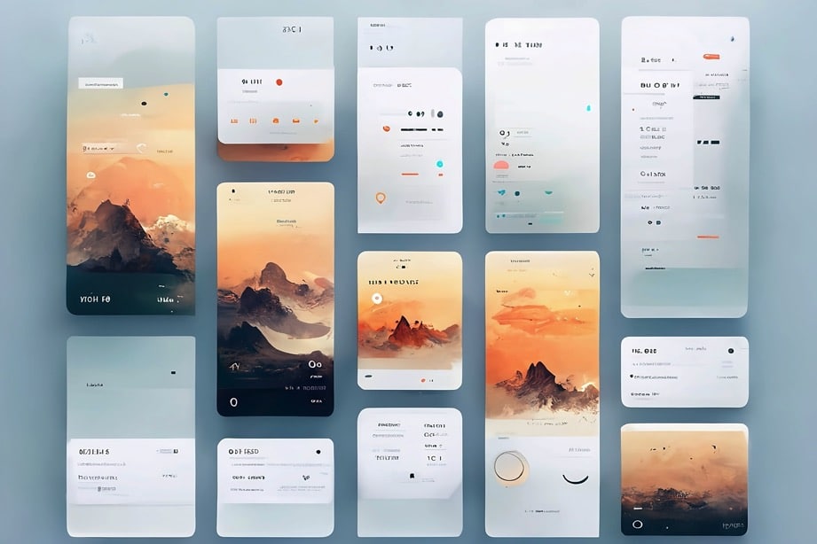
Brand alignment isn’t just about slapping a logo on a website; it’s about creating a cohesive experience that communicates the brand’s essence at every touchpoint. At Creative27, our meticulous approach ensures that the final product:
- Resonates with the Audience: By understanding the target audience, we create experiences that engage and delight.
- Drives Business Growth: Aligned digital products lead to higher engagement, satisfaction, and ultimately, business growth.
- Maintains Consistency: Consistency in design, achieved through effective design systems, fosters trust and brand loyalty.
Partner with Creative27 for Digital Excellence
Our commitment to brand alignment is evident in every project we undertake. From research and strategy to UX and UI design with Figma, we ensure that each digital product we create is a true reflection of the client’s brand, driving engagement and achieving business objectives.
Ready to transform your bold vision into digital excellence? Partner with Creative27 to create a digital experience that’s aligned with your brand and tailored to your audience. Book a free call with us today to discuss your project and discover how we can bring your brand to life in the digital space.


