Summary
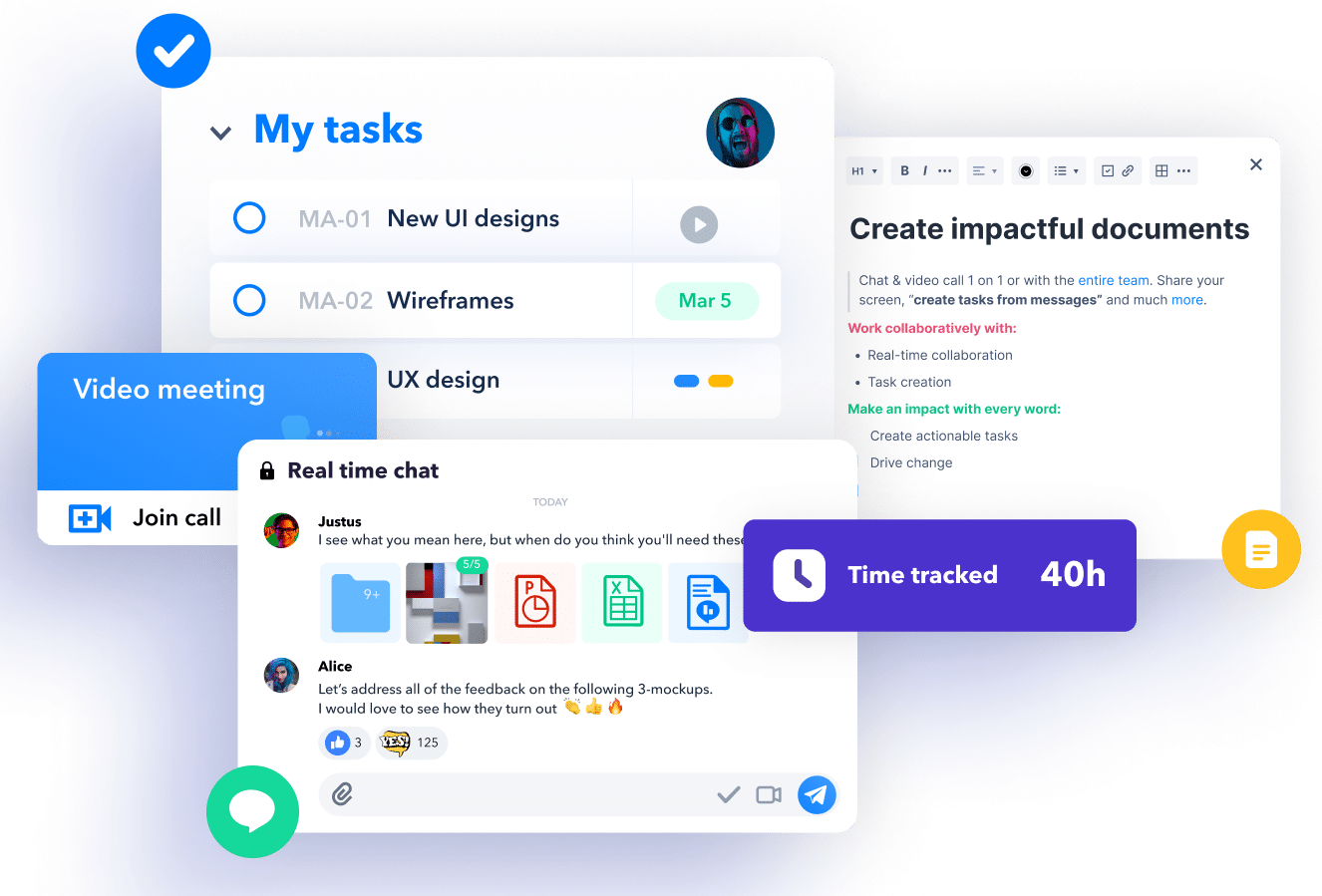
In the crowded project management tool market, Creative27 helped forge Heycollab to distinguish itself. The goal was clear and bold: to craft a SaaS platform that perfectly balances simplicity with capability. This journey started with a thorough market assessment, leading to extensive research guiding each design choice.
Every facet of Heycollab was meticulously crafted. From the user interface to its features, each element was refined for an intuitive, yet powerful experience. The outcome is more than just another project management tool; it’s a groundbreaking solution demonstrating the perfect blend of simplicity and functionality.
Roles
Strategy
Competitive Research
Quantitative Research
Qualitative Research
User Personas
UX & Visual Design
Prototyping
Usability Testing
Campaign Development
Mac/Windows/Web Development
iOS and Android Development
Challenge
In today’s fast-paced digital landscape, teams are trapped in a perpetual relay race—passing the baton from Slack to Trello, Zoom to Harvest, and beyond. This chaotic tool-hopping not only drains efficiency but also inflates per-user costs and turns onboarding into an obstacle course.
Solution
In a digital world full of half-measures and multi-app mayhem, the proposed solution was both audacious and crystal-clear: create a proprietary platform designed to be the ‘one ring’ that rules them all—uniting the fragmented lands of project coordination into one seamless, integrated experience.
Process

Market Research: Quantitative
To gain insights into the operations of distributed teams, we carried out quantitative research focusing on four key areas: communication, project management, collaboration, and online storage & document creation within digital agencies.
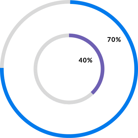
As of 2017, according to earthweb research, over 70% of SMBs within the digital marketing sector pay for multiple tools in order to manage their work and their team. This number is up from 40% in 2011.
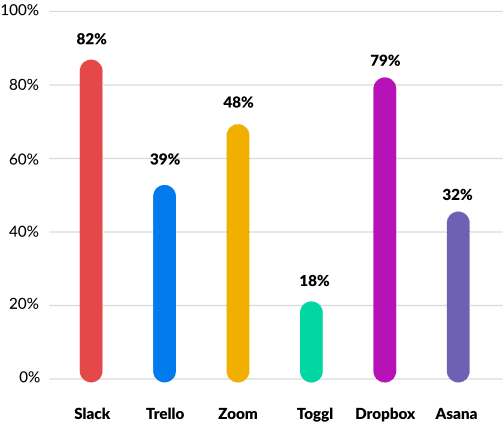
Most agencies use a project management tool at least once a day. This most recent data from Pew which took a look at usage from 2017, shows the breakdown of US project management use by platform.
The tools have become the standard project management and communication tools to coordinate work, people, communication and collaboration within distributed teams. In all cases more than one tool was used daily.
Challenge
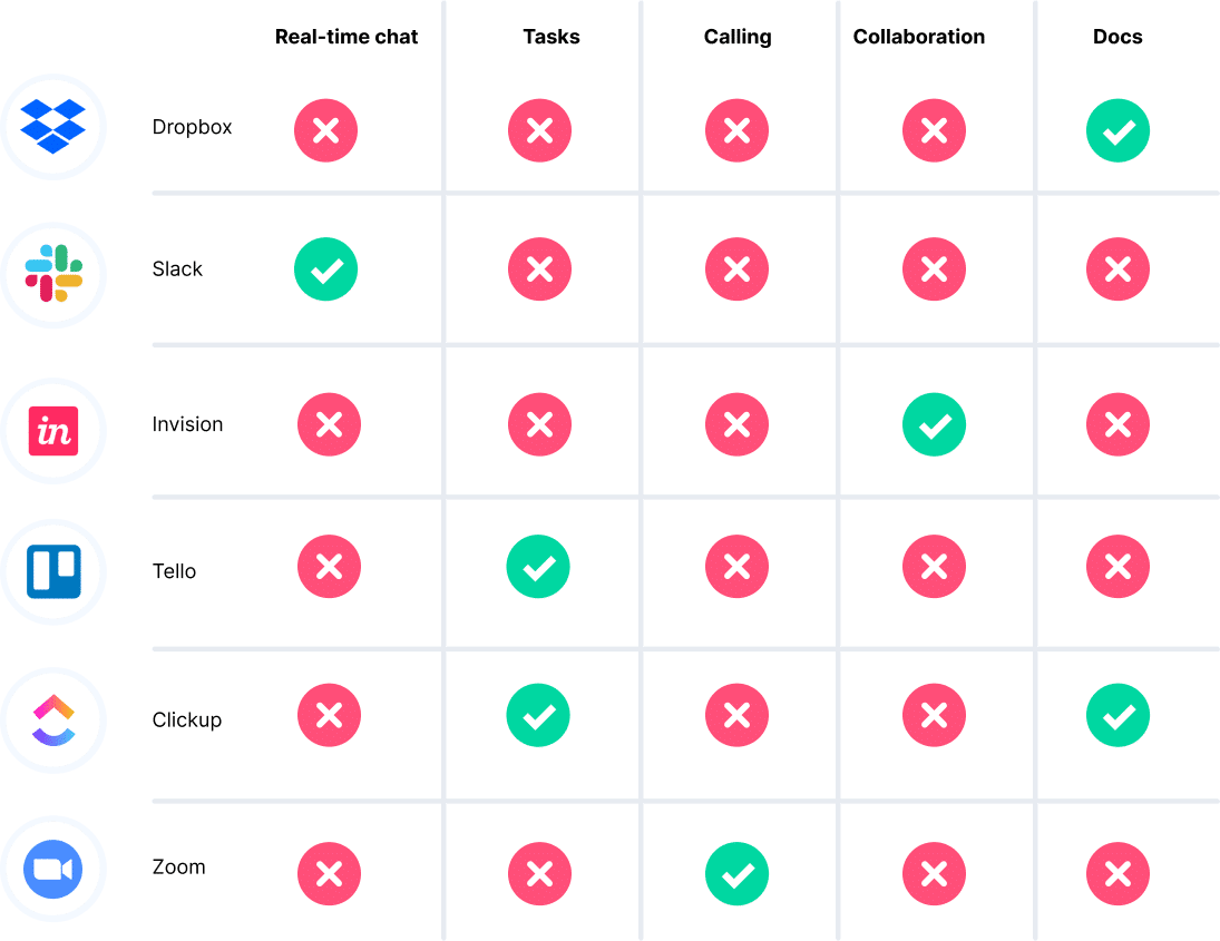
The tools highlighted in the adjacent diagram excel in their specific functions, yet each lacks crucial features necessary for comprehensive project coordination.
Consequently, a company must rely on multiple tools to effectively manage team interactions, tasks, communication, and collaboration.
Market Research: Qualitative
We’ve conducted qualitative research to delve into human behaviors and attitudes. This has involved surveying prospects, holding user interviews, and synthesizing the gathered information. We’ve used these insights to craft empathy maps and user personas, thereby gaining a nuanced understanding of user needs and motivations.
Surveys
We polled 80 international digital agencies to gauge the number of tools they employ for managing projects. The data was clear: every agency indicated they use at least five different tools to coordinate their activities.
Interviews
In the qualitative study, out of the 80 agencies surveyed, we conducted interviews with 30 individuals across 30 distinct agencies, speaking with roles ranging from project managers to designers and developers. Our aim was to comprehend the types of tools they employ and identify their specific challenges.

Synthesis
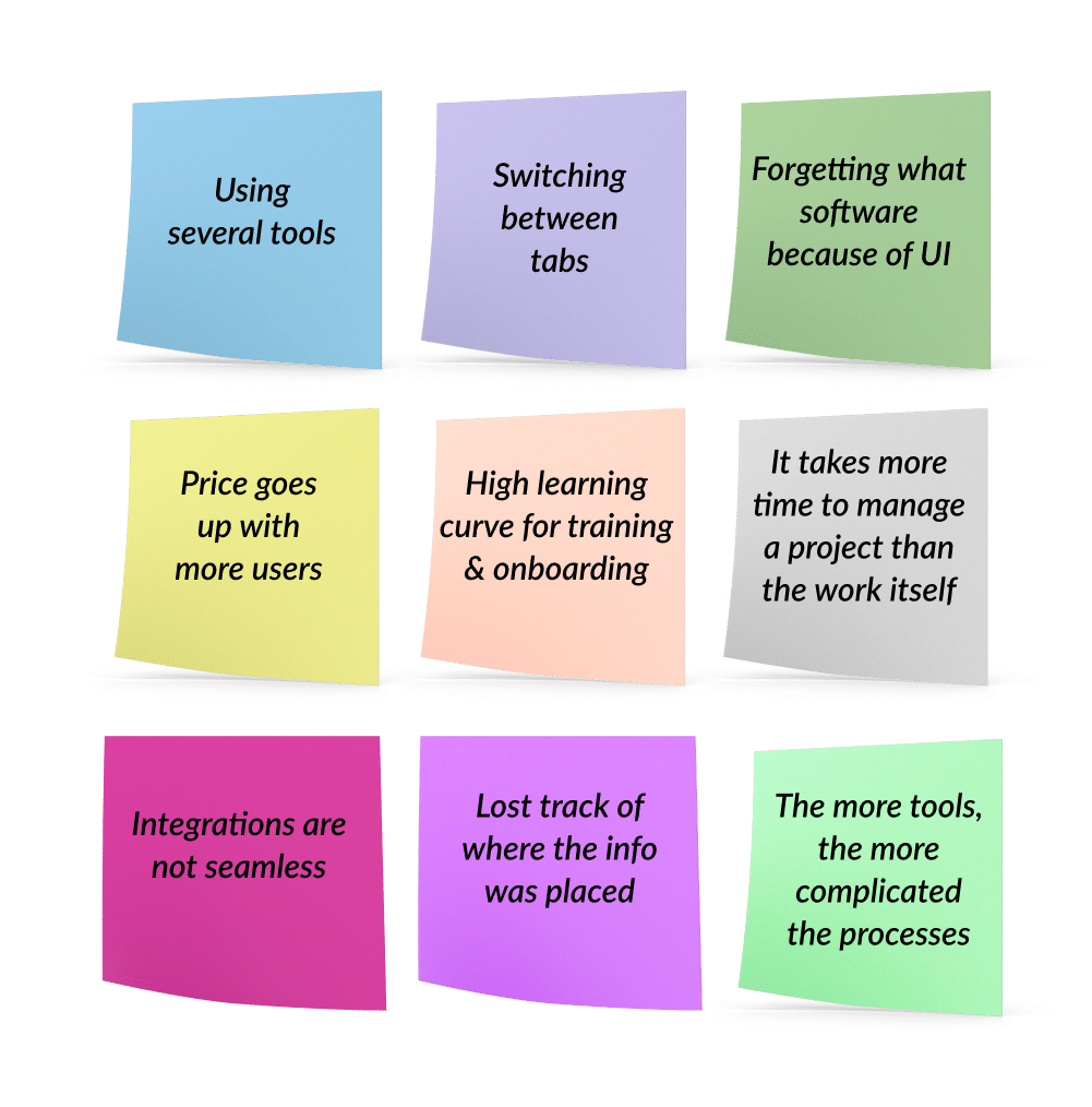
Data showed these key challenges:
Juggling multiple tools hampers productivity, with the act of switching between tabs in crowded browsers being a particular pain point.
Onboarding new team members to various platforms is a time-consuming process.
Any change in the user interface disrupts workflow, as users must adapt to new functionalities.
Scaling the team inflates subscription costs significantly.
- The remarks on the left stem from actual user interviews.
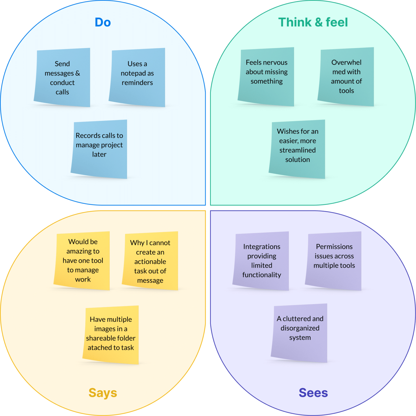
Empathy Map
Through categorizing interview-derived user pain points by thoughts and feelings, visual cues, spoken words, and actions, I was able to systematically organize each issue based on its distinct features.
User Personas
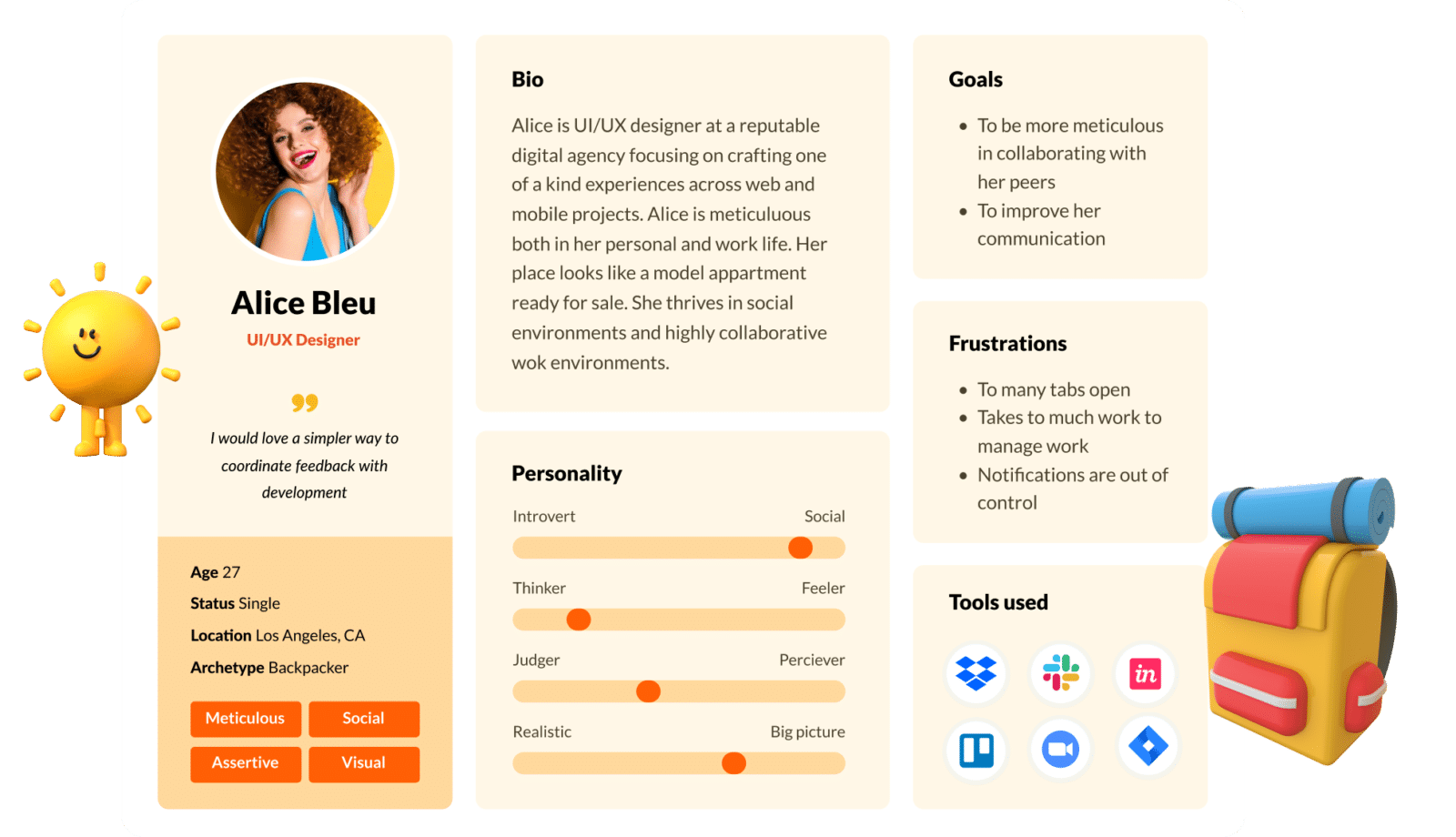
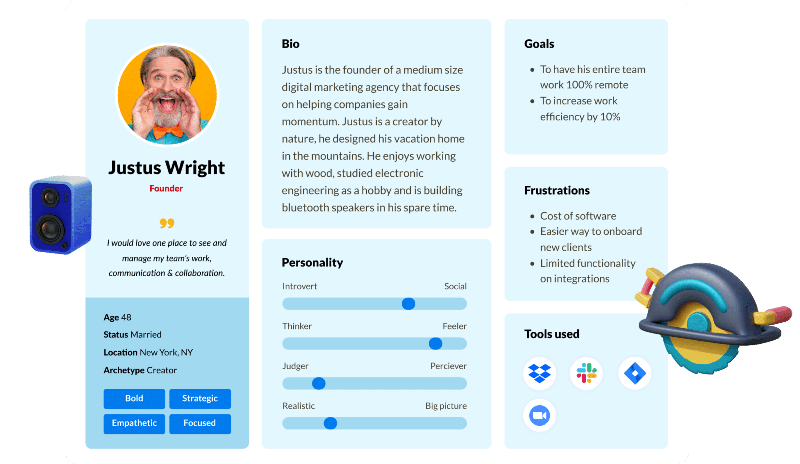
From interviews and user research, We developed user personas that outlined details like age range, occupation, and interests.
These profiles also highlighted commonly used project management tools, objectives, and pain points.
User Experience Design
User Experience Design is the scientific art of crafting the blueprint behind a product’s functionality.
It lays the groundwork for how a user interacts with a product by methodically planning its information architecture, sitemaps, user flows, and both low and high-fidelity wireframes.
This stage is crucial for vetting different hypotheses through usability testing, ensuring the product not only meets but exceeds user expectations.
Information architecture
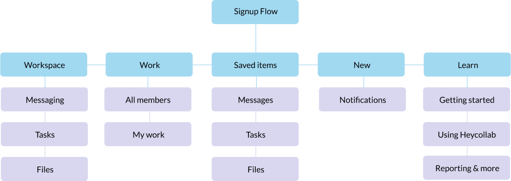
Information architecture played a pivotal role when we aimed to consolidate various functionalities, usually scattered across multiple products, into a single tool. We recognized early on that without meticulous planning, the tool would become too complex for easy adoption and usage.
Signup flow
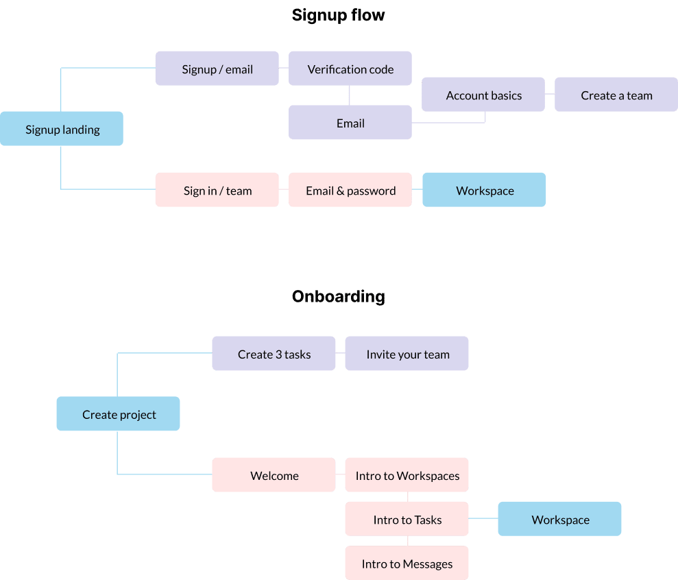
User journey
Armed with a well-defined sitemap that provided a macro-level view, we then honed in on mapping out the specific routes and user flows within the platform. This more granular focus allowed us to ensure a seamless navigation experience across the entire ecosystem.
Sketching
Low-fidelity wireframes serve as rapid iterations to vet the product’s functional methodology.
At this stage, the priority is to nail down the mechanics, sidestepping aesthetic considerations like color, imagery, or illustrations.
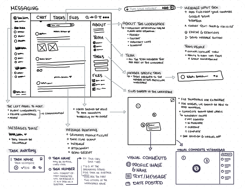
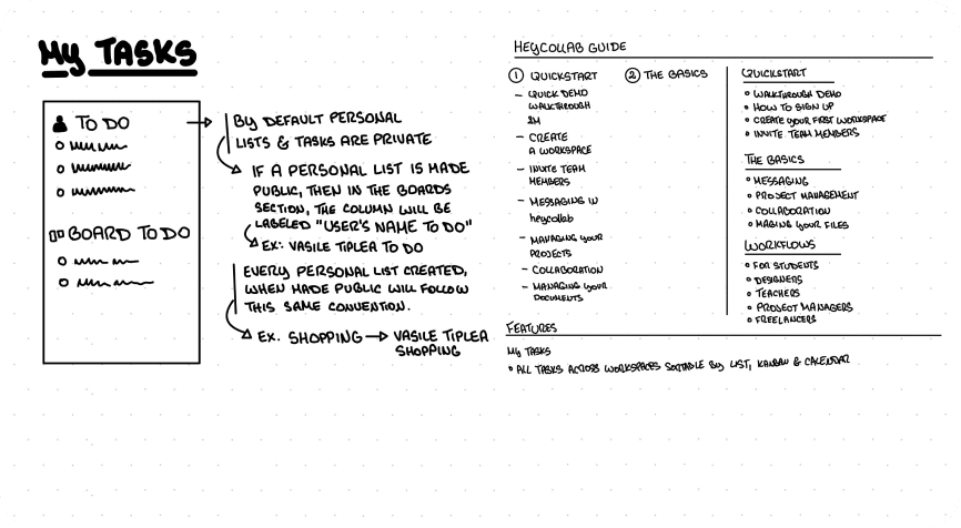
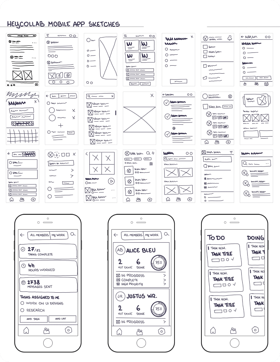
Sketching
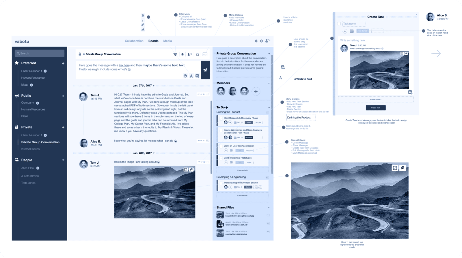
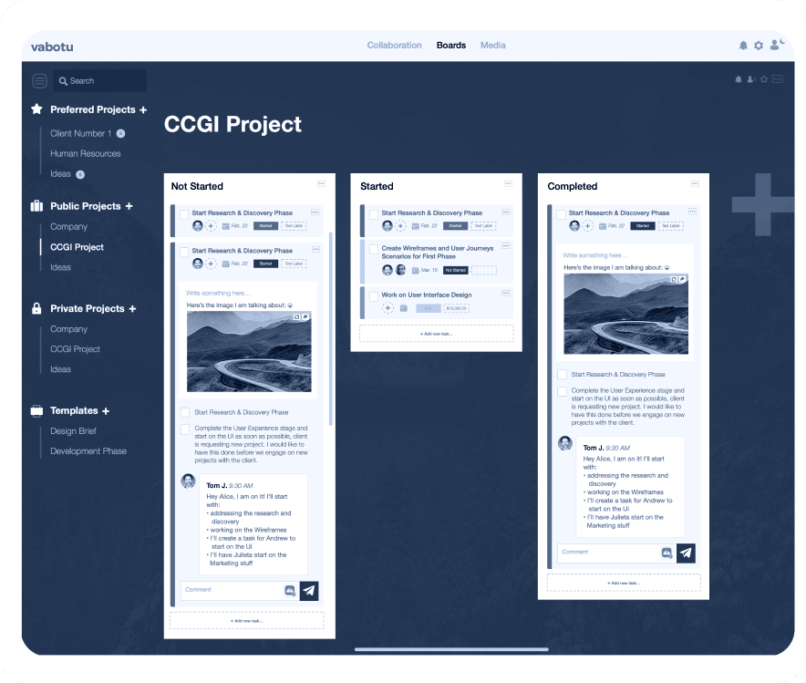
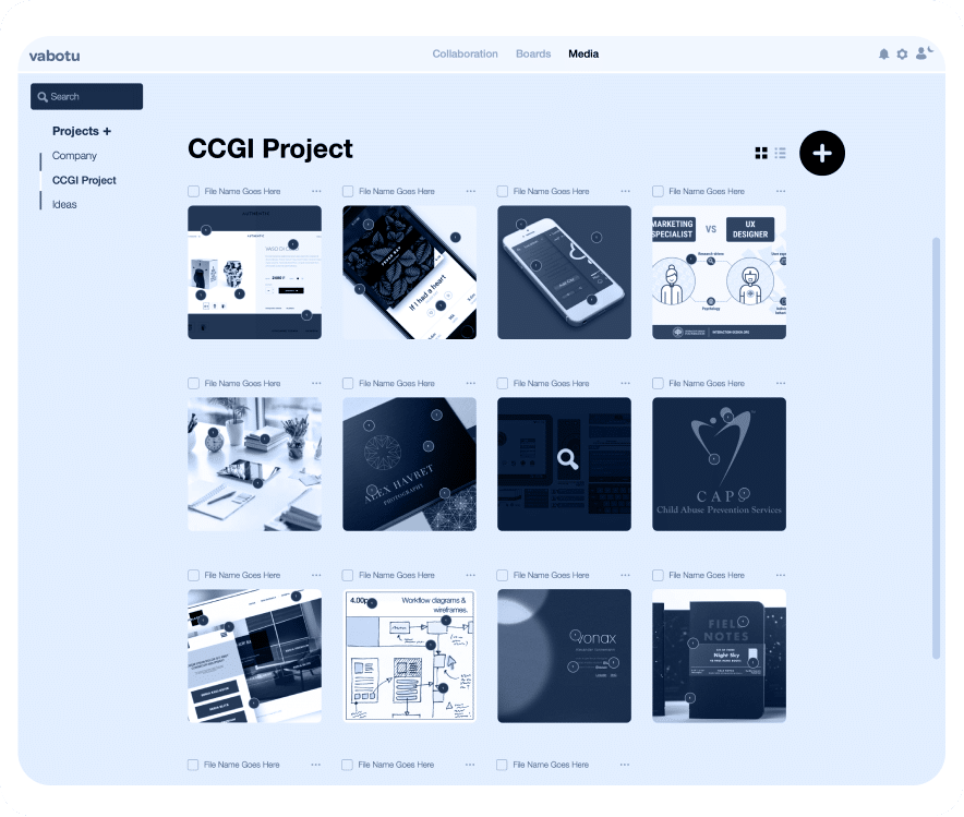
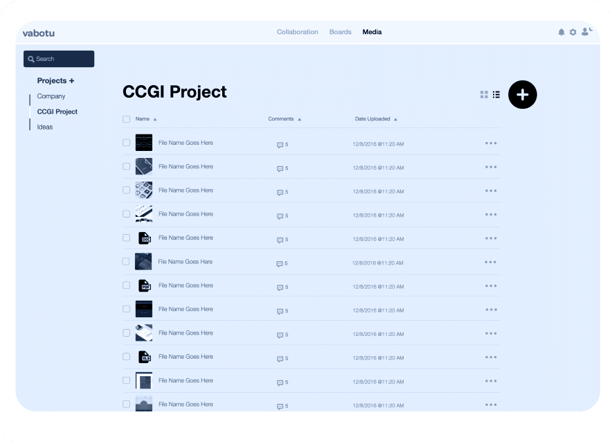
Following the low-fidelity sketches, we transition to annotated, high-fidelity wireframes.
These digital black-and-white renderings offer a more detailed layout, serving as a refined blueprint for the product’s design.
Usability Testing
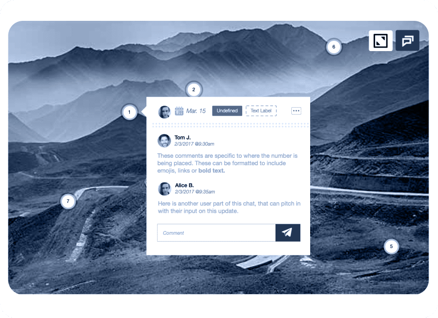
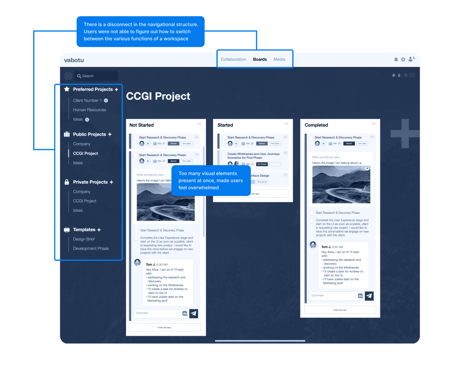
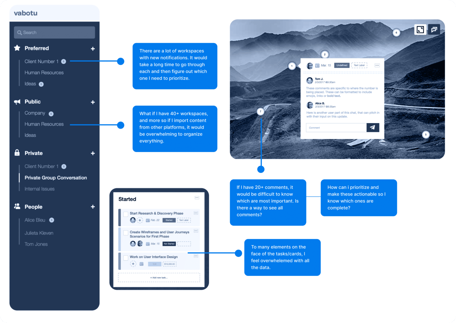
After wireframing the web experience’s core functionality, we crafted an interactive prototype and subjected it to user-based usability testing.
This exercise unearthed several UX challenges that required attention.
User Interface Design: Desktop & Mobile
User Interface (UI) Design is the aesthetic discipline that dictates how a product visually communicates with its users.
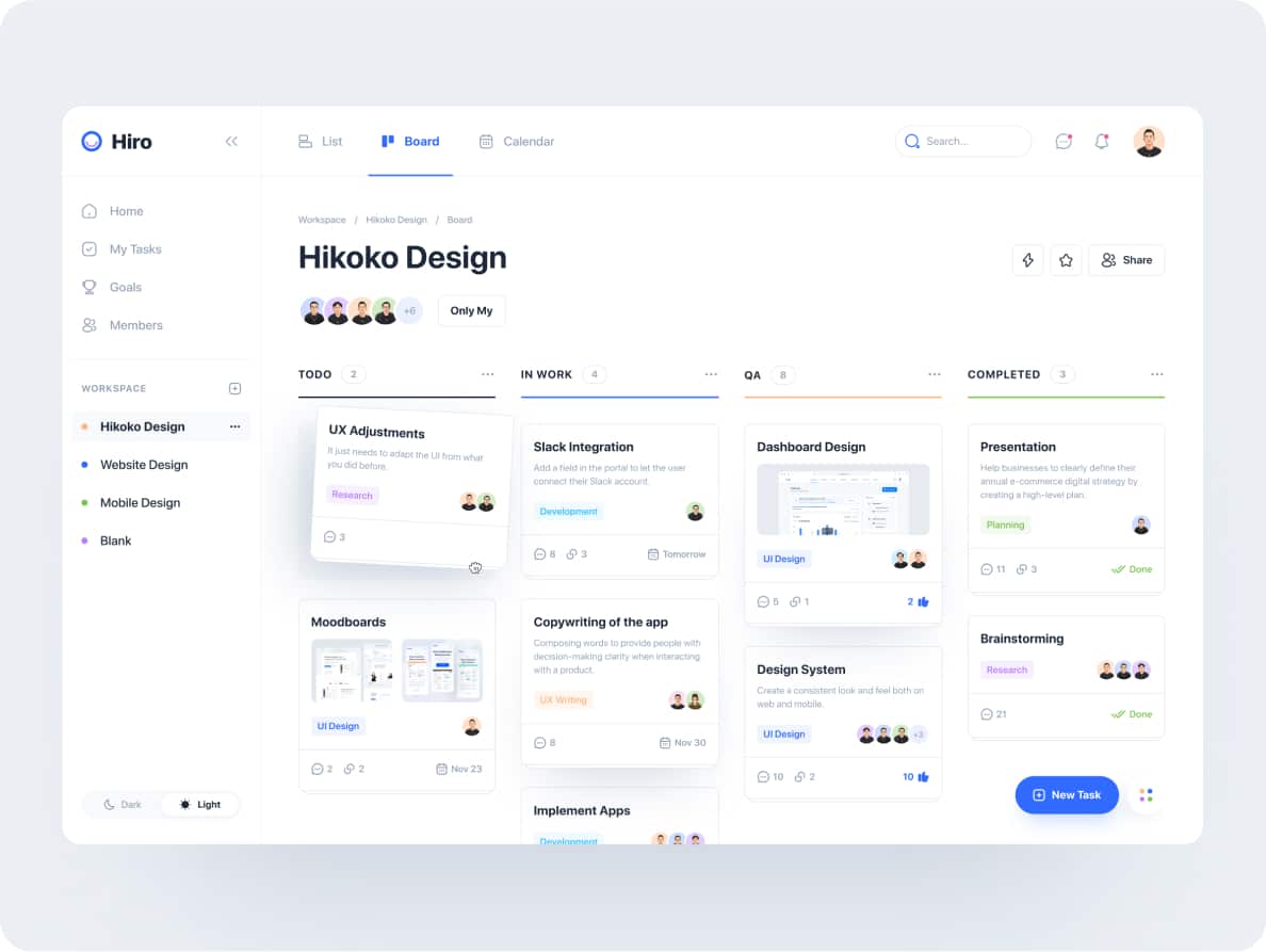
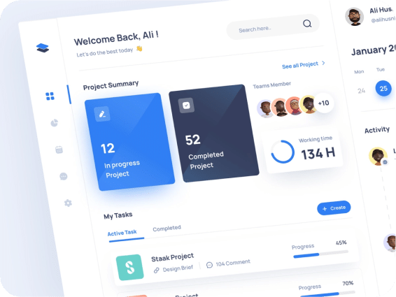
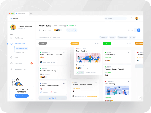
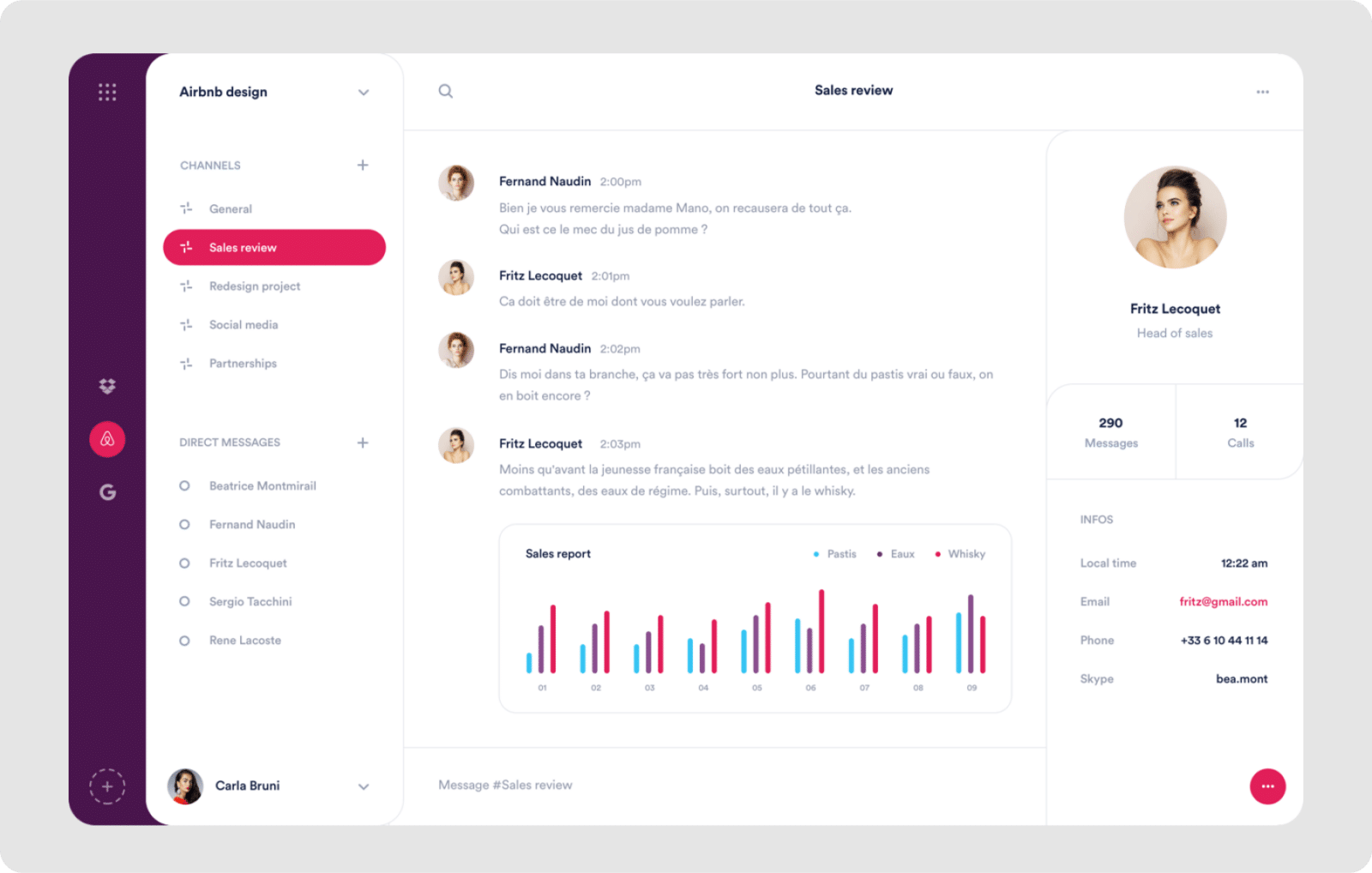
The process kicks off with the creation of mood boards, serving as visual compasses that help define the product’s overall look and feel.
This initial step is instrumental in shaping a cohesive visual language, setting the stage for the subsequent design elements.
Mood-boards

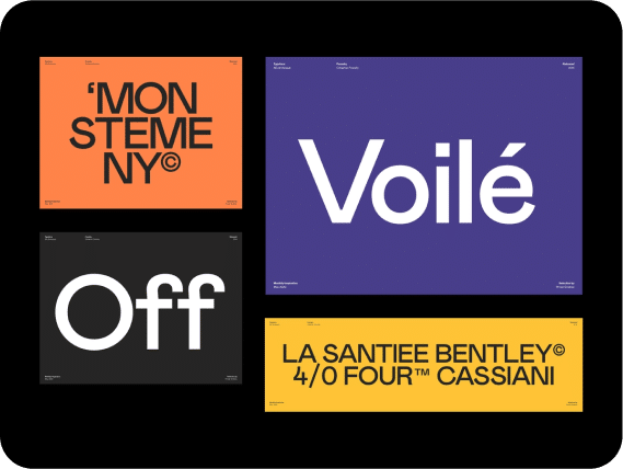

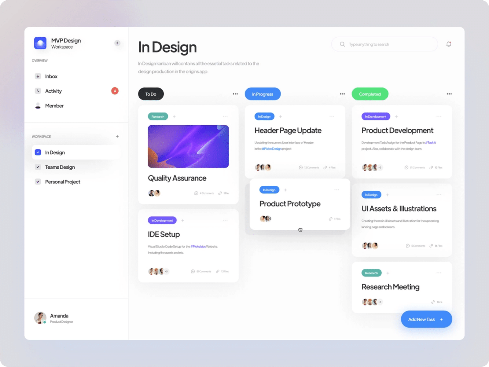
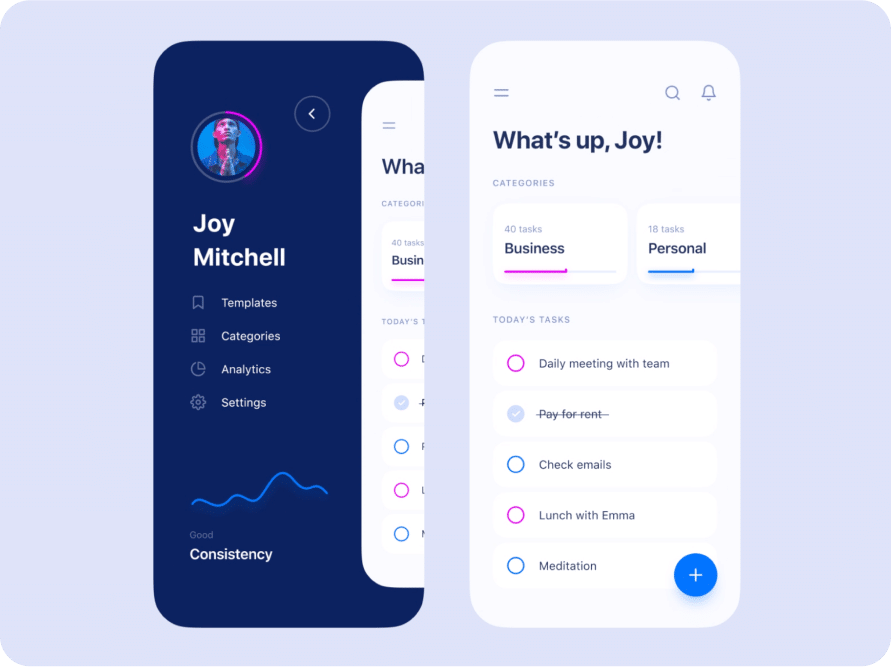
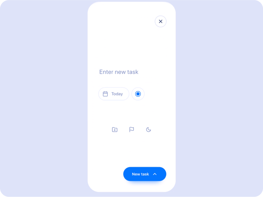
User Interface Design Desktop: Mac app, Windows app, and the Web
User Interface Design Mobile: iOS and Android
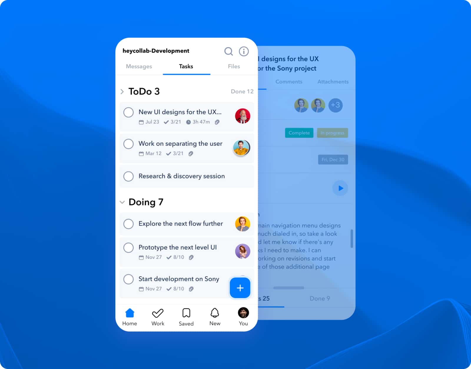

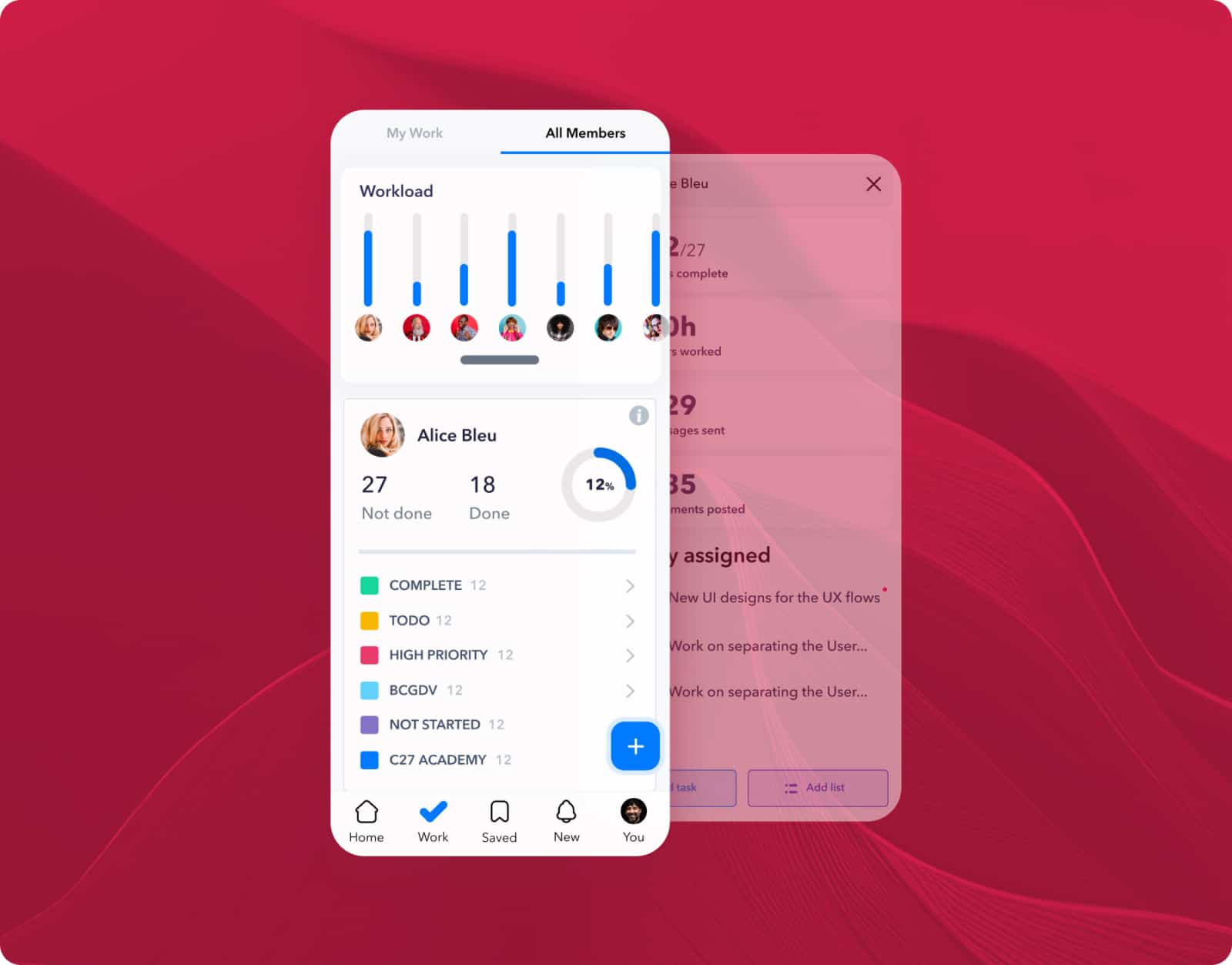
Promo videos
As a key component of our launch campaign, I orchestrated a series of storyboards to produce motion graphics videos.
These visual narratives were designed to amplify awareness and generate excitement about the innovative platform we’ve just unveiled.
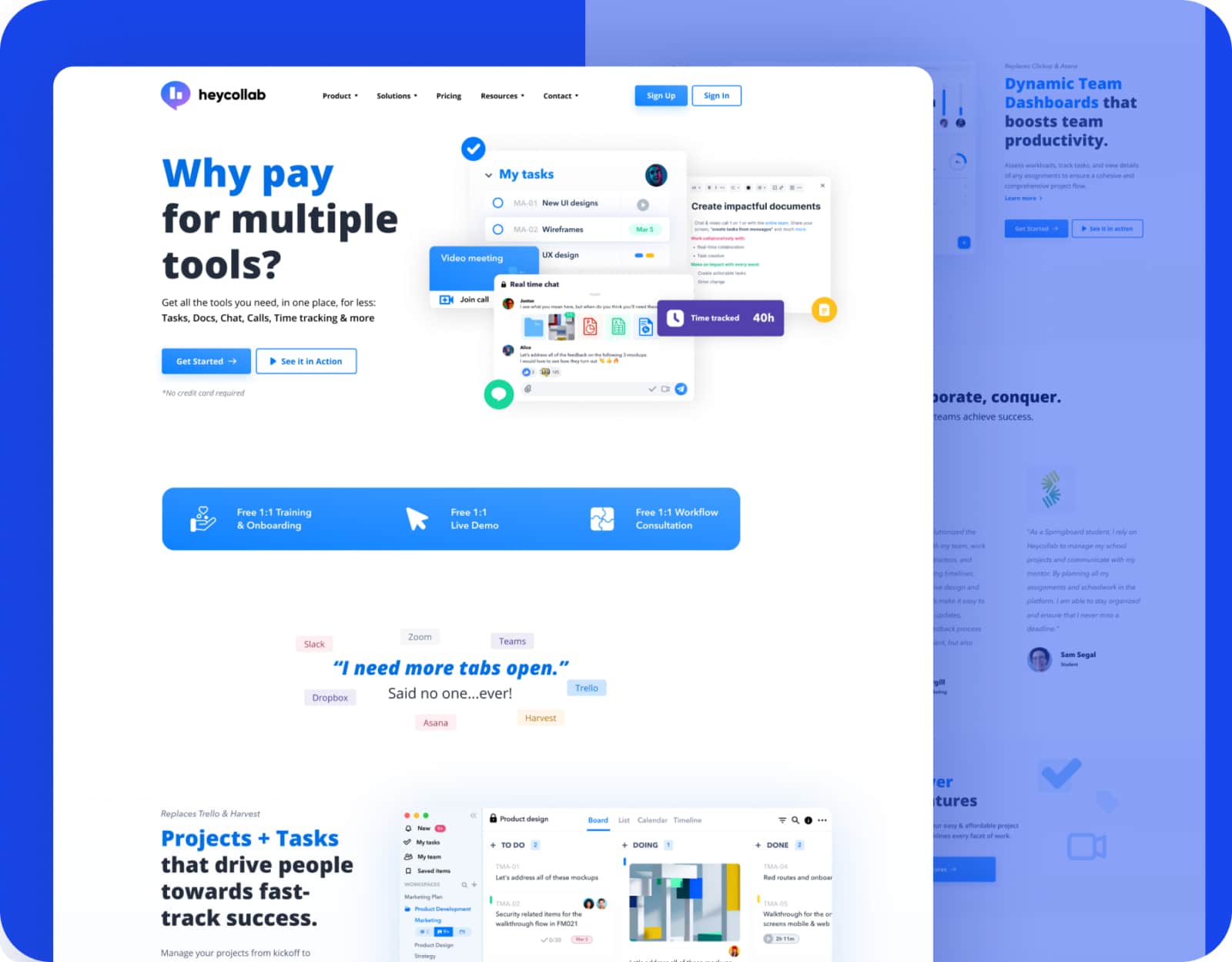
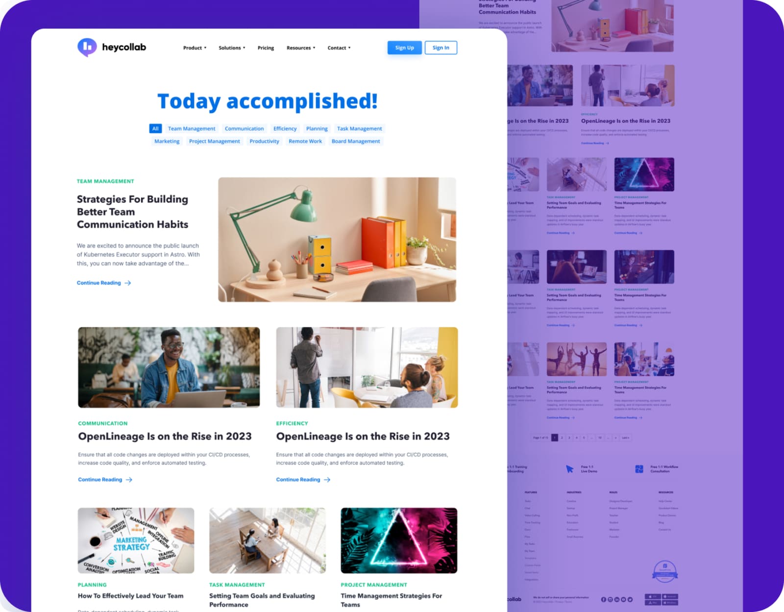
User Interface Design: Marketing Website
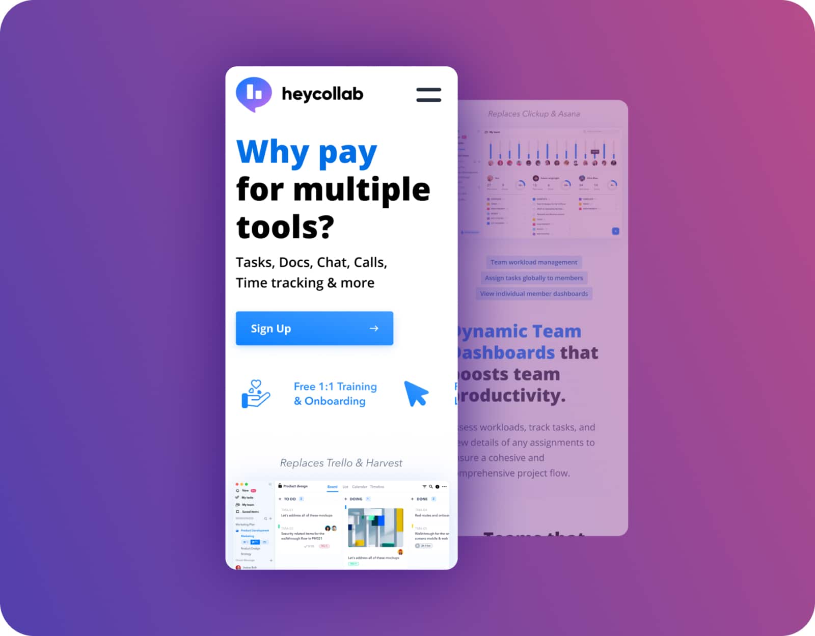
As the creative lead, I orchestrated the design of Heycollab.com’s marketing website. In collaboration with our marketing team, I meticulously crafted the website’s narrative and copy, establishing the cornerstone for Heycollab’s online brand identity.
Together, we transformed vision into a vibrant, user-centric experience that encapsulates the essence of our unified work platform.
Who we impress
Transforming bold visions into digital excellence, as reflected in testimonials from Samsung, Apple, T-Mobile, and more.
“Creative27 excelled in designing websites and logos for two nonprofits I’ve worked with, adapting to our pace with utmost professionalism. Their designs, praised for both aesthetics and user experience, never missed a deadline.”

“Creative27 excelled in designing websites and logos for two nonprofits I’ve worked with, adapting to our pace with utmost professionalism. Their designs, praised for both aesthetics and user experience, never missed a deadline.”

Creative27 excels in UI/UX design, efficiently handling complex projects with clear communication and a focus on modern, user-centric solutions.

Creative27 excels in UI/UX design, efficiently handling complex projects with clear communication and a focus on modern, user-centric solutions.

Creative27 excels in UX/UI design, turning basic ideas into polished, intuitive designs, as shown in their successful wine app project. Their skill in creating elegant solutions and maintaining composure under pressure marks them for future success.

Creative27 excels in UX/UI design, turning basic ideas into polished, intuitive designs, as shown in their successful wine app project. Their skill in creating elegant solutions and maintaining composure under pressure marks them for future success.

Creative27 exceeded expectations with market research and comparative analysis, maintaining high enthusiasm and partnership throughout our project’s development.

Creative27 exceeded expectations with market research and comparative analysis, maintaining high enthusiasm and partnership throughout our project’s development.
“Creative27 is a highly talented and creative digital agency. Their resourcefulness and team spirit make them an excellent asset to any company.”

“Creative27 is a highly talented and creative digital agency. Their resourcefulness and team spirit make them an excellent asset to any company.”

Creative27 is a top-tier UI/UX agency we’ve partnered with on key projects. Their creative output, professionalism, and ability to deliver beyond expectations have consistently resulted in beautiful work.

Creative27 is a top-tier UI/UX agency we’ve partnered with on key projects. Their creative output, professionalism, and ability to deliver beyond expectations have consistently resulted in beautiful work.
“We worked with the Creative27 team & had terrific results. Creative27 was able to help us visualize & understand our project with great clarity & efficiency. It’s why we chose to work with them again & again!”

“We worked with the Creative27 team & had terrific results. Creative27 was able to help us visualize & understand our project with great clarity & efficiency. It’s why we chose to work with them again & again!”
“Besides their excellent creative abilities, what sets Creative27 apart is their tight process, quick turnaround, and consistency in delivering good quality work.”

“Besides their excellent creative abilities, what sets Creative27 apart is their tight process, quick turnaround, and consistency in delivering good quality work.”
Working with Creative27 on our flagship product was a pleasure. Their artistic design and UX mastery, along with deep product design discussions, were invaluable. Thank you!

Working with Creative27 on our flagship product was a pleasure. Their artistic design and UX mastery, along with deep product design discussions, were invaluable. Thank you!
Find out how we can put solutions like these work for you.
Click, submit, and consider us talking. 24 hours max.


