
Revitalized HairCode quiz by curbing dropout rates through a focused UX/UI redesign, guided by a best-practices audit.

Summary
Procter and Gamble’s HairCode quiz aimed to personalize the haircare journey by providing curated product recommendations and care techniques based on quiz results and local weather conditions. However, the platform was plagued with challenges, including high dropout rates at the lead-generation stage. Creative27’s initial approach involved a comprehensive best-practices audit where we dissected the strategies of top competitors to identify efficient user engagement techniques.
Armed with insights, we executed a complete overhaul of both the user experience (UX) and user interface (UI), focusing on streamlining the quiz journey while subtly incorporating lead generation elements, thus ensuring a more engaging user flow.
Responsibilities
Client Services
Best Practices Audit
User Experience Design
User Interface Design

Challenge
Procter and Gamble’s HairCode quiz was designed to provide tailored haircare advice, but faced the hurdle of high user dropout rates at the lead generation phase. Despite its educational value and customization, the quiz wasn’t retaining users, affecting its overall effectiveness.
Solution
To resolve this, Creative27 initiated a thorough best-practices audit to identify areas for improvement and gain insights into competitor strategies. Using these findings as a foundation, we spearheaded a full UX/UI redesign aimed at not only enhancing the user experience but also reducing the dropout rates at the lead generation stage.
Best Practices Audit
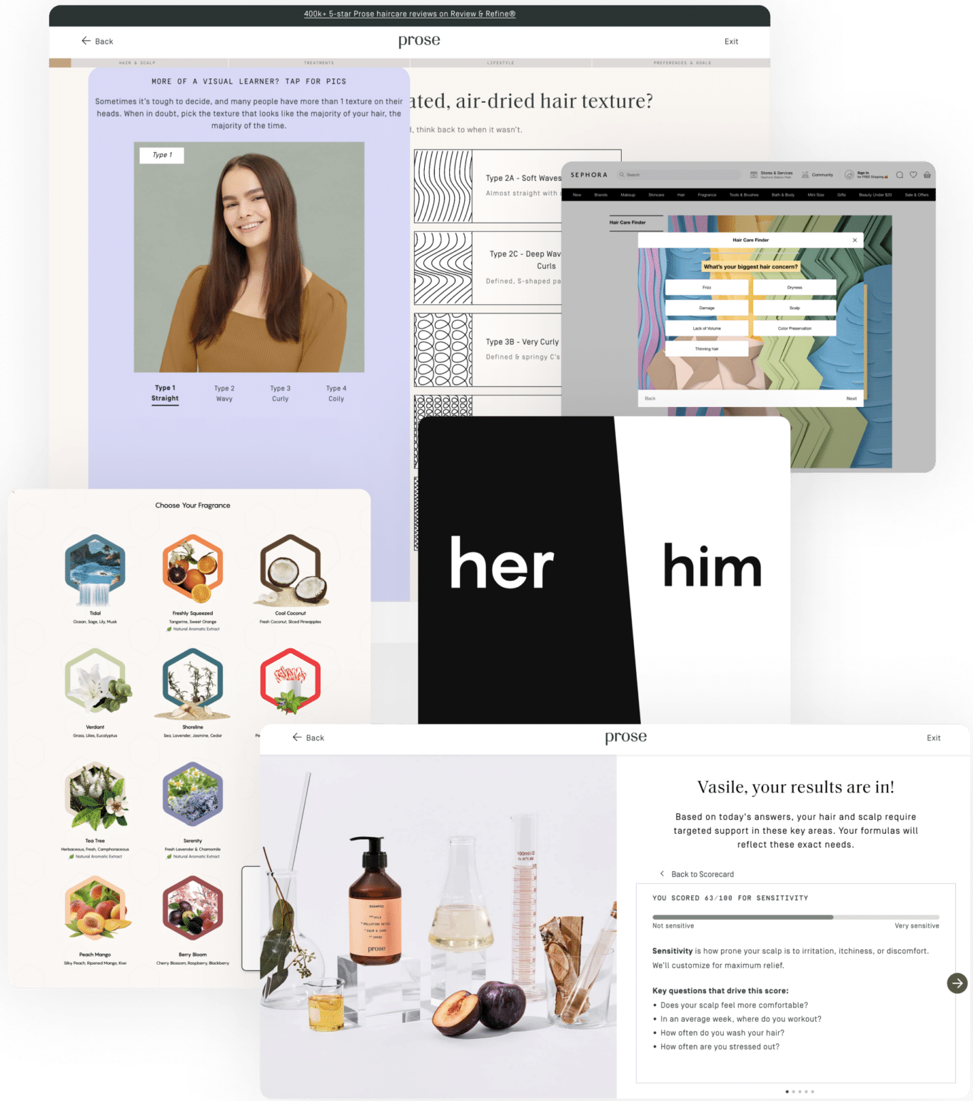
Leveraging a keen eye for detail, we scrutinized leading industry quizzes from Prose, Function of Beauty, Vegamour, Sephora, and Formulate. The goal? To dissect their commonalities, efficiencies, and unique selling propositions.
This audit served as an insightful expedition, unearthing gems that would inform and elevate the revamped P&G HairCode experience into a veritable best-in-class offering.
Audit Findings
After a thorough analysis of the existing product and an investigative deep dive into top competitors, I have curated the following recommendations for elevating our user experience:
- Incorporate well-defined steppers and progress bars to guide users through the quiz.
- Introduce a slide-up menu that provides additional information and assistance.
- Use section breakpoints to effectively divide the quiz into digestible chapters.
- Transition from a scrolling model to a stepped slide approach for smoother navigation.
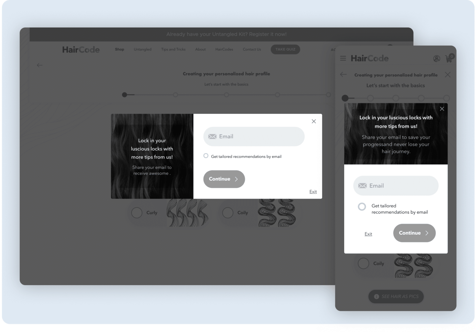
- Explore inventive methods for email capture, as seen with our competitors
- Consider compressing multiple questions onto a single slide to shorten the quiz duration.
- Leverage geolocation data to provide personalized insights.
- Feature a testimonial page before unveiling quiz results to build trust.
- Emulate Prose’s collapsible results page for a more engaging reveal.
- Auto-fill users’ carts with recommended products post-quiz for immediate conversion.

User Experience Design: Responsive
After thoroughly auditing Haircode’s existing quiz and top competitors in the market, I gathered invaluable insights.
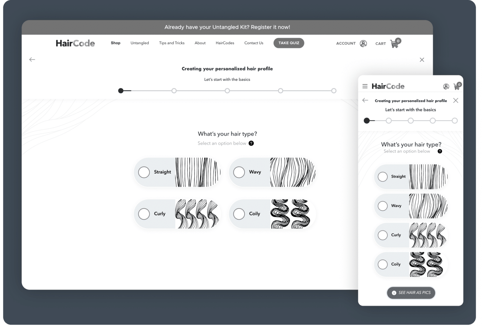
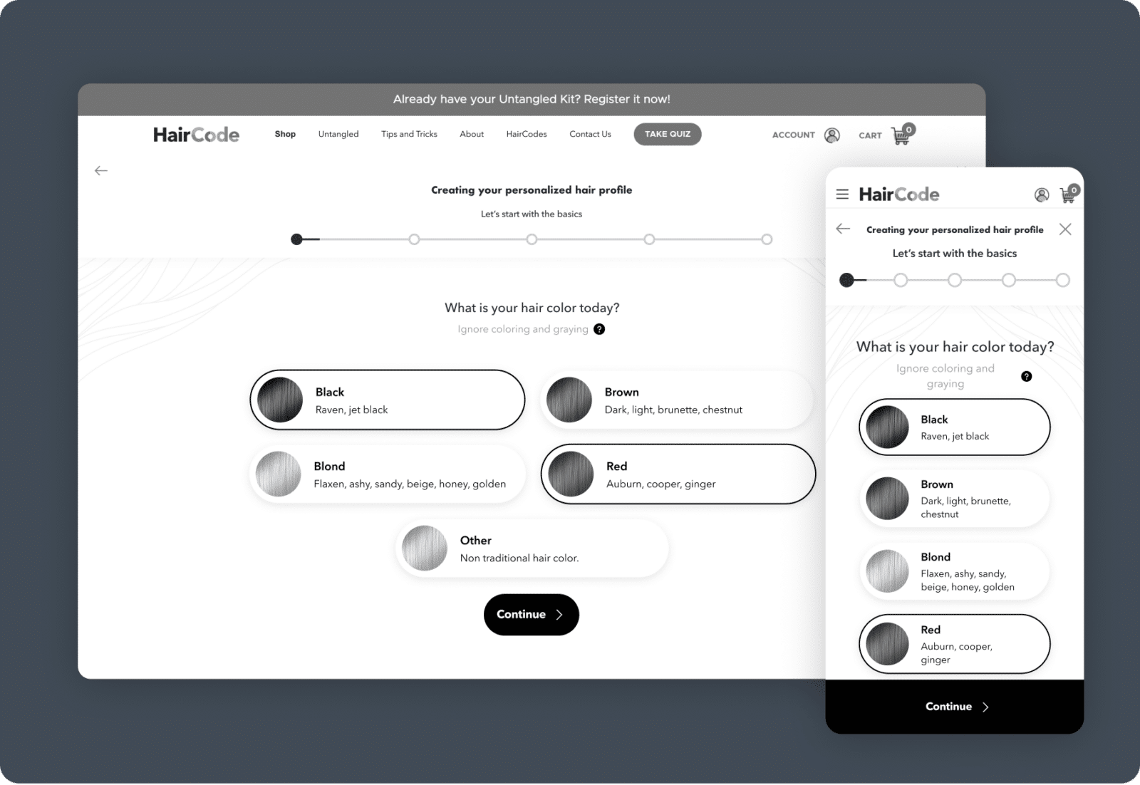
Armed with this data, I began the meticulous process of redefining the blueprint for the new Haircode quiz, emphasizing a user-friendly and intuitive experience.
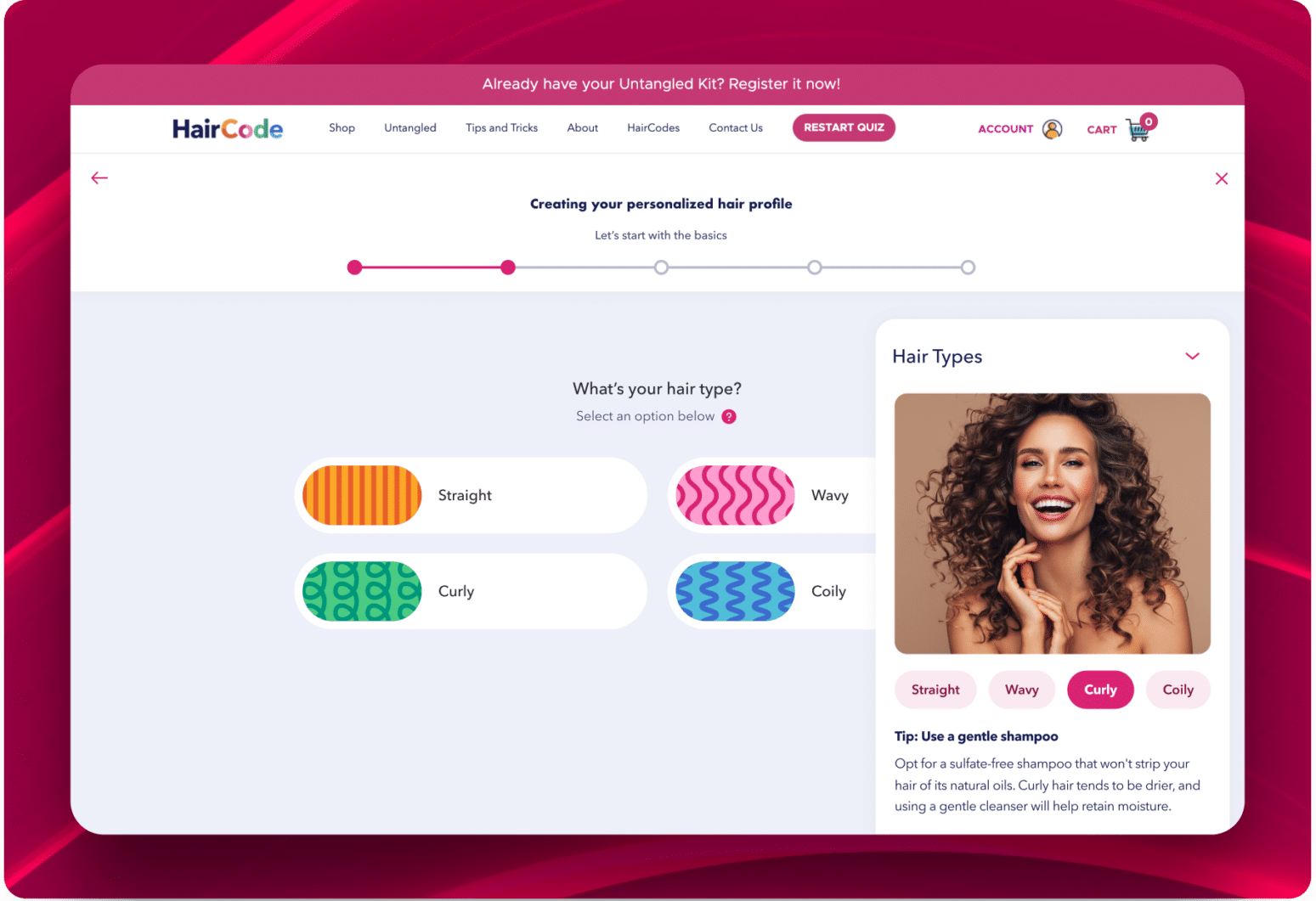
User Interface Design: Responsive
Leveraging Haircode’s established branding guidelines, we transformed our high-fidelity wireframes into a polished user interface design.
This phase served as the aesthetic bridge between the user’s needs and the brand’s identity, creating a harmonious user experience.


Who we impress
Transforming bold visions into digital excellence, as reflected in testimonials from Samsung, Apple, T-Mobile, and more.
“Creative27 excelled in designing websites and logos for two nonprofits I’ve worked with, adapting to our pace with utmost professionalism. Their designs, praised for both aesthetics and user experience, never missed a deadline.”

“Creative27 excelled in designing websites and logos for two nonprofits I’ve worked with, adapting to our pace with utmost professionalism. Their designs, praised for both aesthetics and user experience, never missed a deadline.”

Creative27 excels in UI/UX design, efficiently handling complex projects with clear communication and a focus on modern, user-centric solutions.

Creative27 excels in UI/UX design, efficiently handling complex projects with clear communication and a focus on modern, user-centric solutions.

Creative27 excels in UX/UI design, turning basic ideas into polished, intuitive designs, as shown in their successful wine app project. Their skill in creating elegant solutions and maintaining composure under pressure marks them for future success.

Creative27 excels in UX/UI design, turning basic ideas into polished, intuitive designs, as shown in their successful wine app project. Their skill in creating elegant solutions and maintaining composure under pressure marks them for future success.

Creative27 exceeded expectations with market research and comparative analysis, maintaining high enthusiasm and partnership throughout our project’s development.

Creative27 exceeded expectations with market research and comparative analysis, maintaining high enthusiasm and partnership throughout our project’s development.
“Creative27 is a highly talented and creative digital agency. Their resourcefulness and team spirit make them an excellent asset to any company.”

“Creative27 is a highly talented and creative digital agency. Their resourcefulness and team spirit make them an excellent asset to any company.”

Creative27 is a top-tier UI/UX agency we’ve partnered with on key projects. Their creative output, professionalism, and ability to deliver beyond expectations have consistently resulted in beautiful work.

Creative27 is a top-tier UI/UX agency we’ve partnered with on key projects. Their creative output, professionalism, and ability to deliver beyond expectations have consistently resulted in beautiful work.
“We worked with the Creative27 team & had terrific results. Creative27 was able to help us visualize & understand our project with great clarity & efficiency. It’s why we chose to work with them again & again!”

“We worked with the Creative27 team & had terrific results. Creative27 was able to help us visualize & understand our project with great clarity & efficiency. It’s why we chose to work with them again & again!”
“Besides their excellent creative abilities, what sets Creative27 apart is their tight process, quick turnaround, and consistency in delivering good quality work.”

“Besides their excellent creative abilities, what sets Creative27 apart is their tight process, quick turnaround, and consistency in delivering good quality work.”
Working with Creative27 on our flagship product was a pleasure. Their artistic design and UX mastery, along with deep product design discussions, were invaluable. Thank you!

Working with Creative27 on our flagship product was a pleasure. Their artistic design and UX mastery, along with deep product design discussions, were invaluable. Thank you!
Find out how we can put solutions like these work for you.
Click, submit, and consider us talking. 24 hours max.


