Orchestrated the Brand Transition from Fujitsu to Ricoh in the Document Scanning Sector, Maintaining Market Leadership.
Summary
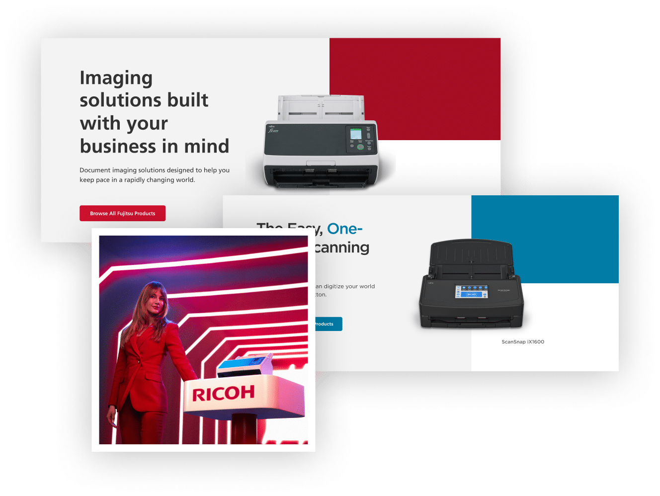
As part of the rebranding transition from Fujitsu to Ricoh, Creative27 took on the crucial role of reassuring our customer base about the consistent quality and reliability they’ve come to expect. Conducting a thorough competitor’s audit, we provided a creative brief, recommendations, and standards, as well as suggested direction for the brand’s future.
Leveraging these insights, we spearheaded an awareness campaign to communicate the new name and maintain confidence in the brand’s industry-leading performance.
Roles
Client Services
Strategy
Production
Competitive Audit
User Experience Design
User Interface Design
Challenge
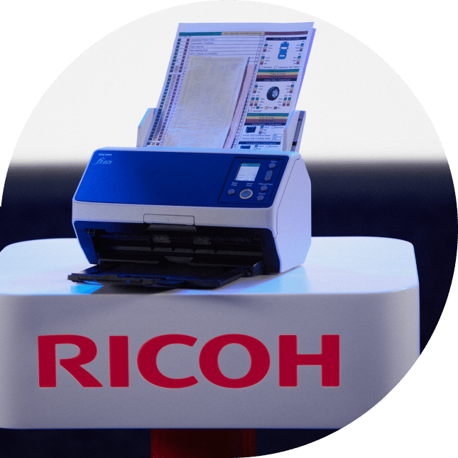
Navigating the transition from Fujitsu to Ricoh Document Scanners presented a complex challenge: retaining customer loyalty and trust while unveiling a new brand identity.
Solution
Creative27 led a robust awareness campaign that was sensitive to the brand’s past and future.
By leveraging Ricoh’s own merits and technological prowess, we ensured that the core values and high performance that customers associated with Fujitsu were communicated as continuing cornerstones in the Ricoh era.
Shopping Experience Brief
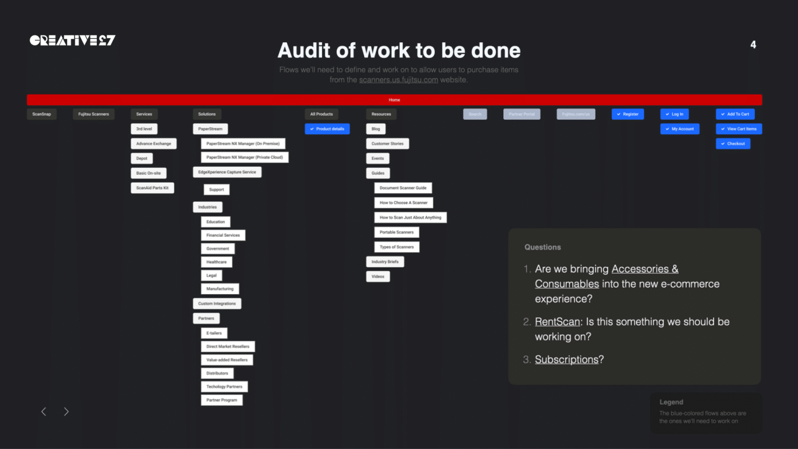
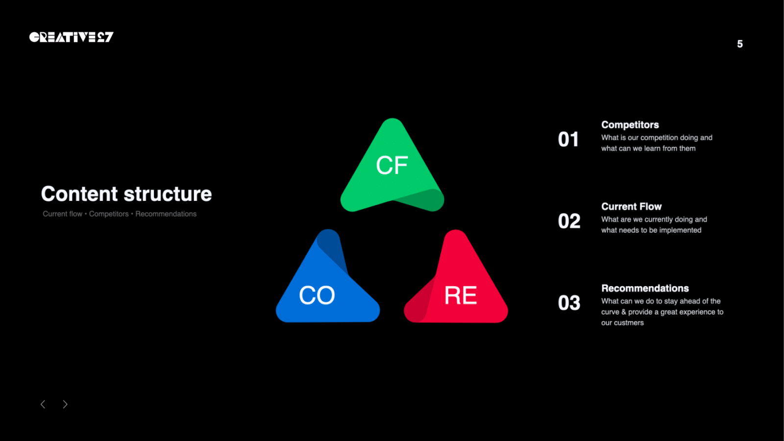
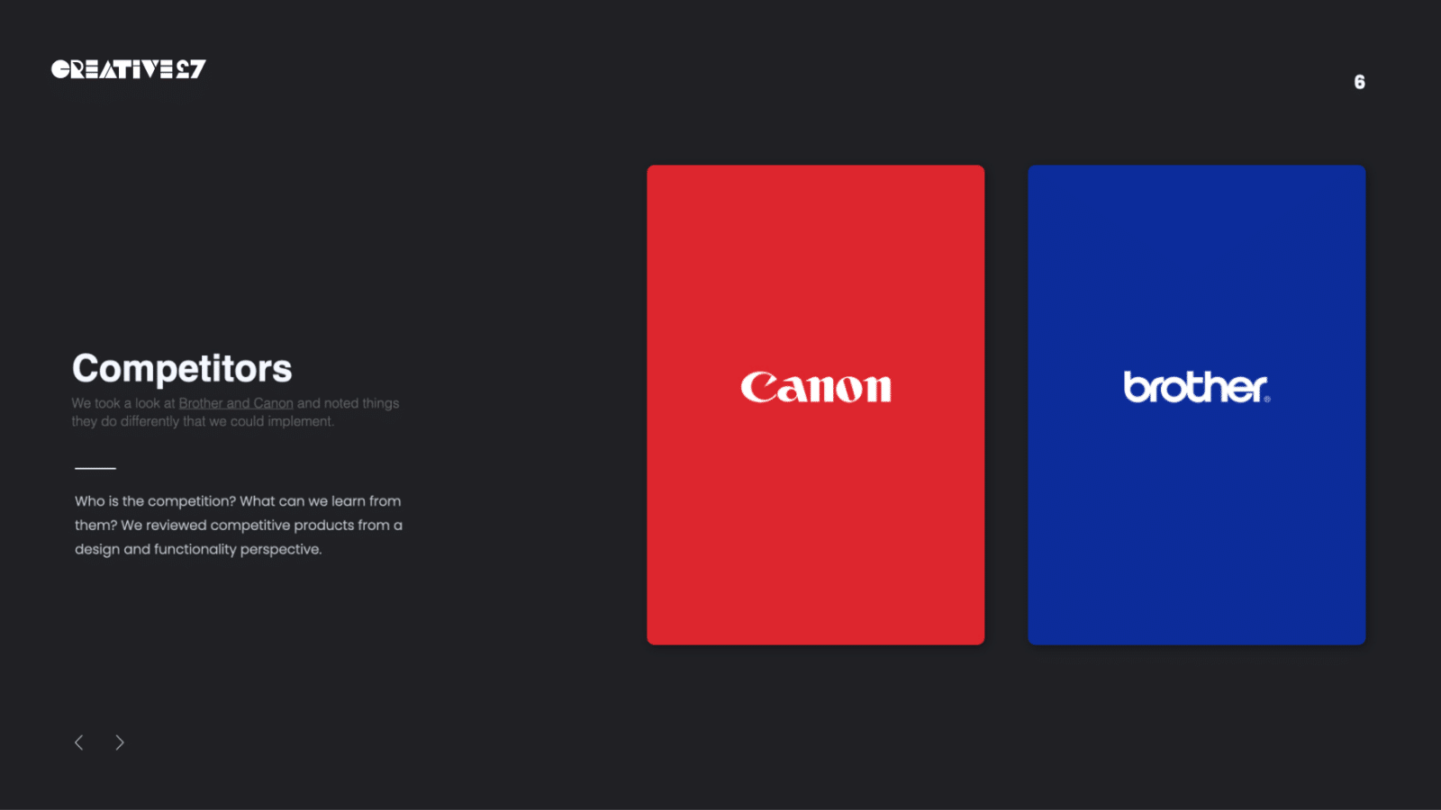
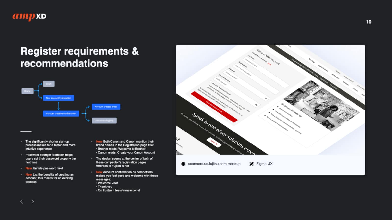
Creative27 carried out an in-depth competitor’s audit to gauge our standing in the market. This audit included a comprehensive creative brief, strategic recommendations, and a snapshot of competitors and industry standards.
Based on these insights, we then formulated a suggested direction to keep us at the forefront of the industry.

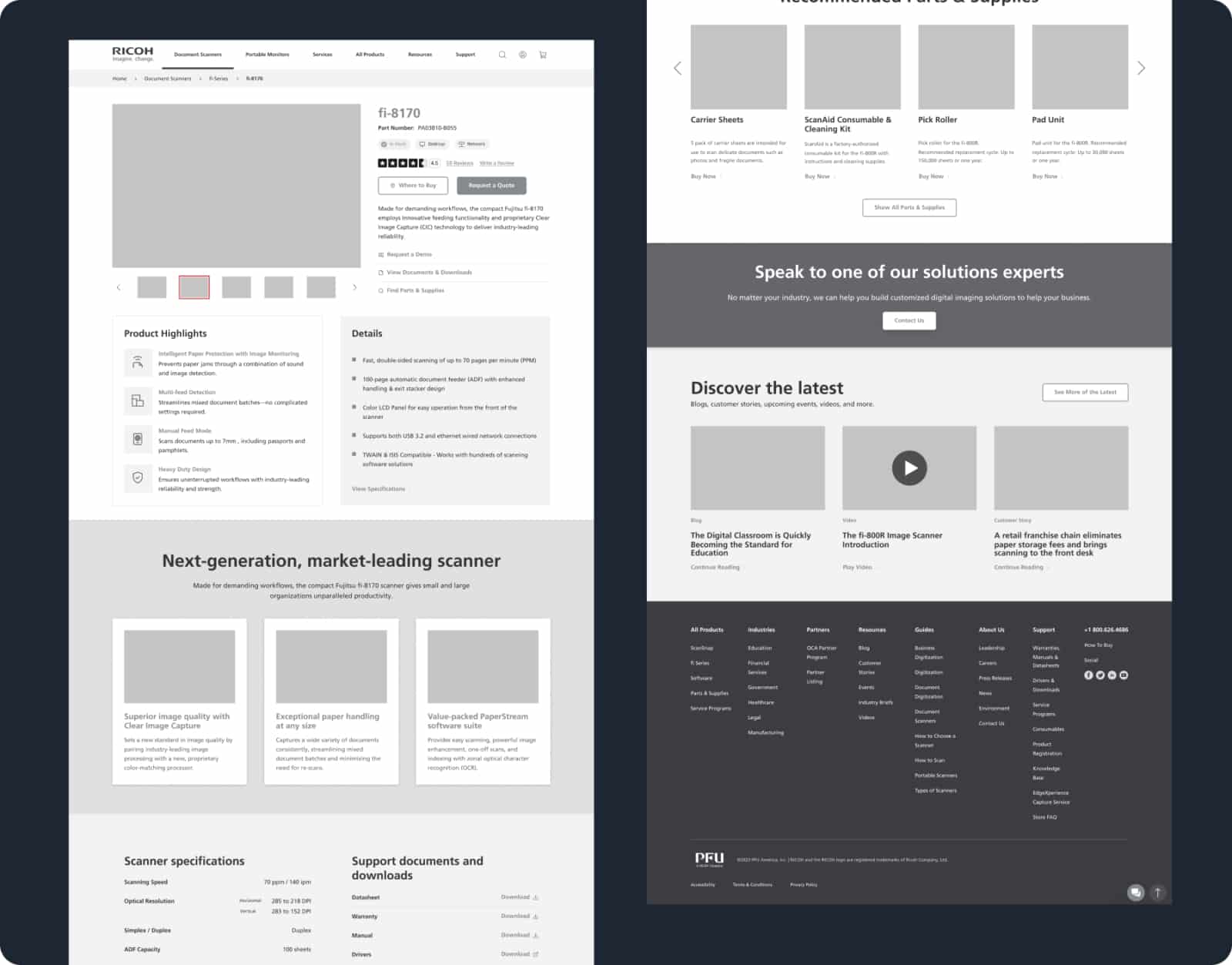
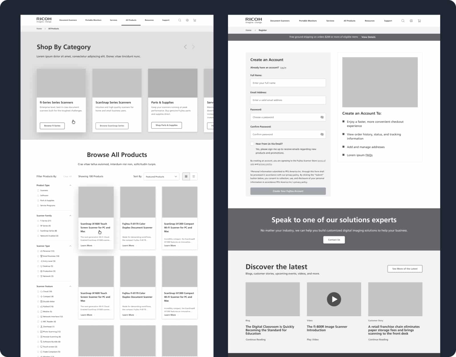
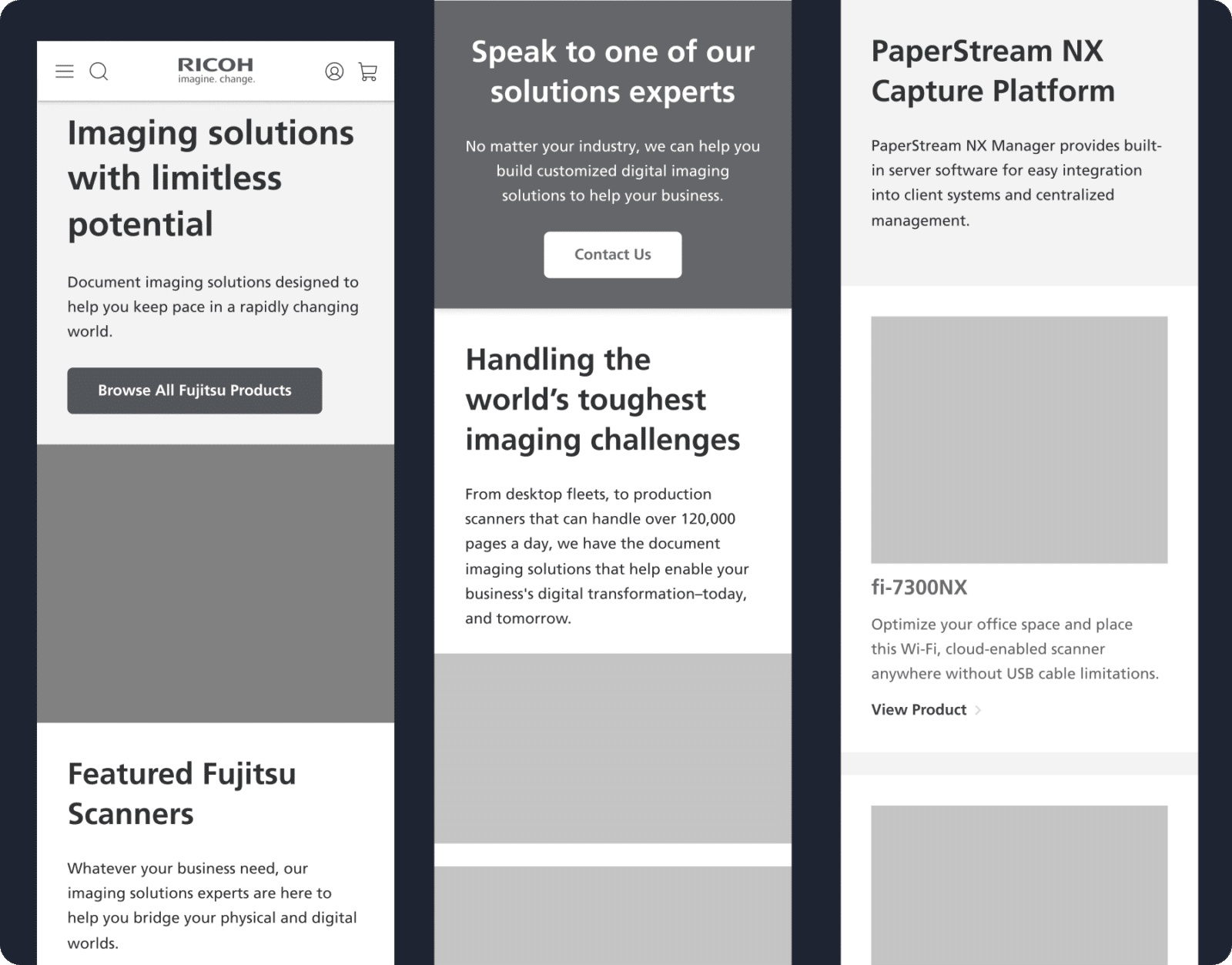
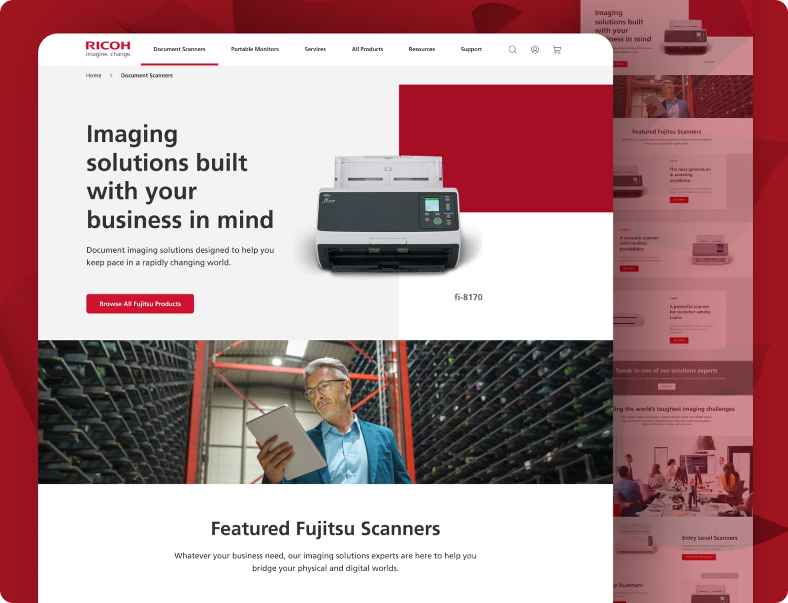
User Experience Design: Responsive
In the UX Design phase for Ricoh, the focus was on crafting a user-friendly experience that maintained the brand’s trusted reliability and performance.
Live Action Video
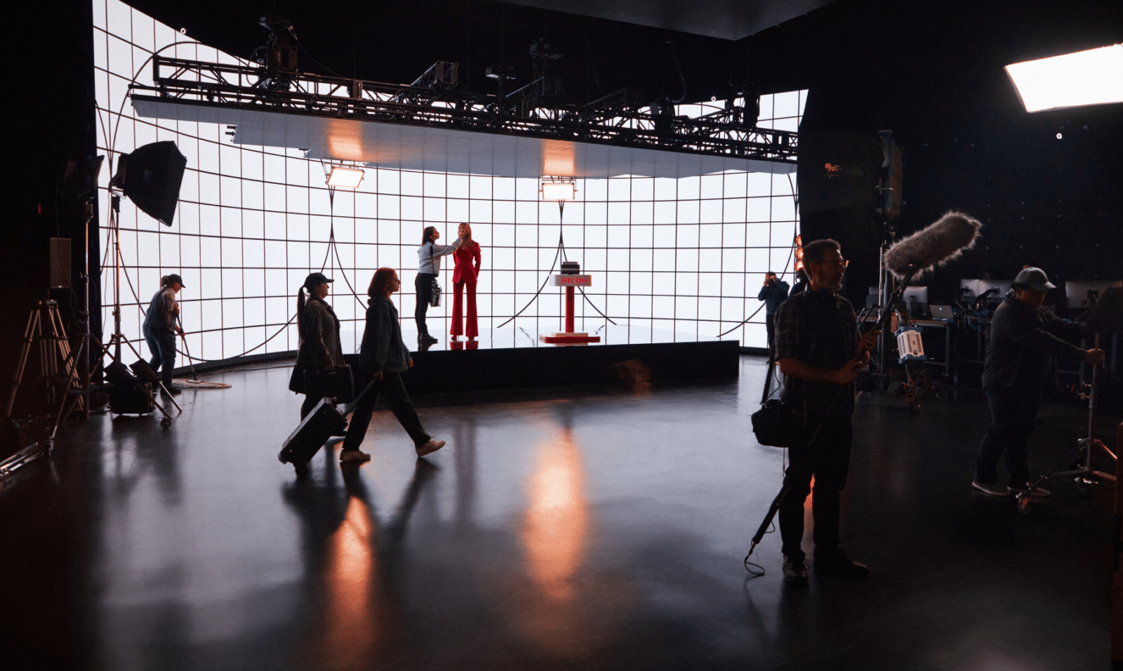
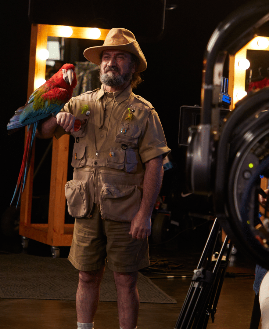
In crafting our campaign, we dialed up the drama to spotlight a “tempest in a teapot”—a simple name change. The live-action video is essentially a matryoshka doll of commercials; it’s a spectacle within a spectacle.
Here, our star actress and the audience simultaneously come to the comedic realization that we’ve set a minor tweak against a backdrop of ludicrously grandiose theatrics.
Behind the scenes


Final Video
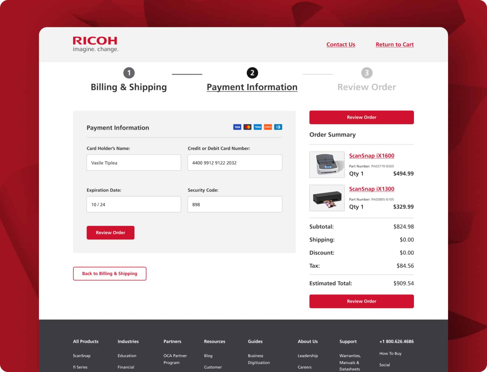
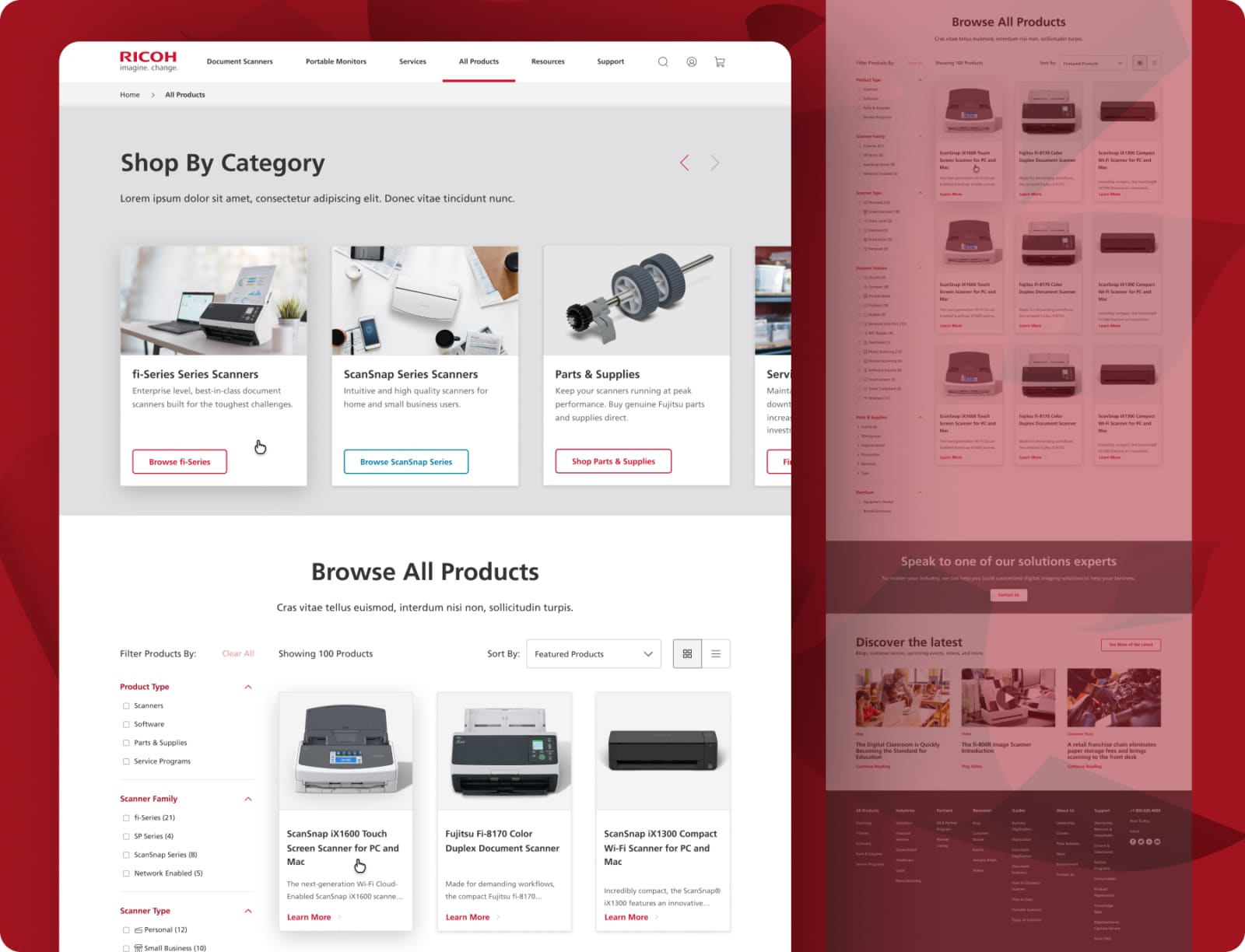
User Interface Design: Responsive
In the UI Design phase for Ricoh’s transition campaign, we drew upon the company’s new branding guidelines to create a cohesive user interface for our digital platforms.
This seamlessly integrated design served not only as a natural extension of the rebranded Ricoh identity but also as a complementary visual element to our live-action motion graphics video and overall campaign strategy.

Who we impress
Transforming bold visions into digital excellence, as reflected in testimonials from Samsung, Apple, T-Mobile, and more.
“Creative27 excelled in designing websites and logos for two nonprofits I’ve worked with, adapting to our pace with utmost professionalism. Their designs, praised for both aesthetics and user experience, never missed a deadline.”

“Creative27 excelled in designing websites and logos for two nonprofits I’ve worked with, adapting to our pace with utmost professionalism. Their designs, praised for both aesthetics and user experience, never missed a deadline.”

Creative27 excels in UI/UX design, efficiently handling complex projects with clear communication and a focus on modern, user-centric solutions.

Creative27 excels in UI/UX design, efficiently handling complex projects with clear communication and a focus on modern, user-centric solutions.

Creative27 excels in UX/UI design, turning basic ideas into polished, intuitive designs, as shown in their successful wine app project. Their skill in creating elegant solutions and maintaining composure under pressure marks them for future success.

Creative27 excels in UX/UI design, turning basic ideas into polished, intuitive designs, as shown in their successful wine app project. Their skill in creating elegant solutions and maintaining composure under pressure marks them for future success.

Creative27 exceeded expectations with market research and comparative analysis, maintaining high enthusiasm and partnership throughout our project’s development.

Creative27 exceeded expectations with market research and comparative analysis, maintaining high enthusiasm and partnership throughout our project’s development.
“Creative27 is a highly talented and creative digital agency. Their resourcefulness and team spirit make them an excellent asset to any company.”

“Creative27 is a highly talented and creative digital agency. Their resourcefulness and team spirit make them an excellent asset to any company.”

Creative27 is a top-tier UI/UX agency we’ve partnered with on key projects. Their creative output, professionalism, and ability to deliver beyond expectations have consistently resulted in beautiful work.

Creative27 is a top-tier UI/UX agency we’ve partnered with on key projects. Their creative output, professionalism, and ability to deliver beyond expectations have consistently resulted in beautiful work.
“We worked with the Creative27 team & had terrific results. Creative27 was able to help us visualize & understand our project with great clarity & efficiency. It’s why we chose to work with them again & again!”

“We worked with the Creative27 team & had terrific results. Creative27 was able to help us visualize & understand our project with great clarity & efficiency. It’s why we chose to work with them again & again!”
“Besides their excellent creative abilities, what sets Creative27 apart is their tight process, quick turnaround, and consistency in delivering good quality work.”

“Besides their excellent creative abilities, what sets Creative27 apart is their tight process, quick turnaround, and consistency in delivering good quality work.”
Working with Creative27 on our flagship product was a pleasure. Their artistic design and UX mastery, along with deep product design discussions, were invaluable. Thank you!

Working with Creative27 on our flagship product was a pleasure. Their artistic design and UX mastery, along with deep product design discussions, were invaluable. Thank you!
Find out how we can put solutions like these work for you.
Click, submit, and consider us talking. 24 hours max.


