
Diving Deep, Coming Up Clear: Navigating the Data Abyss with Scuba’s Revamped UX/UI

Summary
Welcome to Scuba—the treasure trove of data visualization. But wait, is it really a treasure if you can’t make heads or tails of it? That’s where Creative27 stepped in. Tasked with detangling the data jungle that left users swimming in confusion, we led a comprehensive redesign. The mission: make the platform as intuitive as it is intelligent while honoring Scuba’s brand ethos.
The result? A user-friendly experience that turns data overload into actionable insights, helping customers to not just keep their heads above water, but to actually enjoy the swim.
Our Roles
Client Services
Information Architecture
User Research
User Experience Design
User Interface Design

Challenge
The platform’s richness was its Achilles’ heel—users found themselves drowning in an ocean of data, overwhelmed by the very insights meant to enlighten them. It was analytics paralysis at its finest, a case of too much of a good thing.
Solution
By spearheading an intuitive UX/UI overhaul, Creative27 transformed the platform into a navigable, user-friendly dashboard. While preserving Scuba’s foundational brand elements, I simplified the data presentation and streamlined the user flow.
Now, Scuba’s clients can cut through the data fog to find their North Star—making better decisions without the mental gymnastics.
User Experience Design
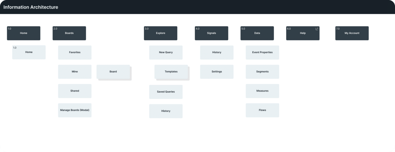
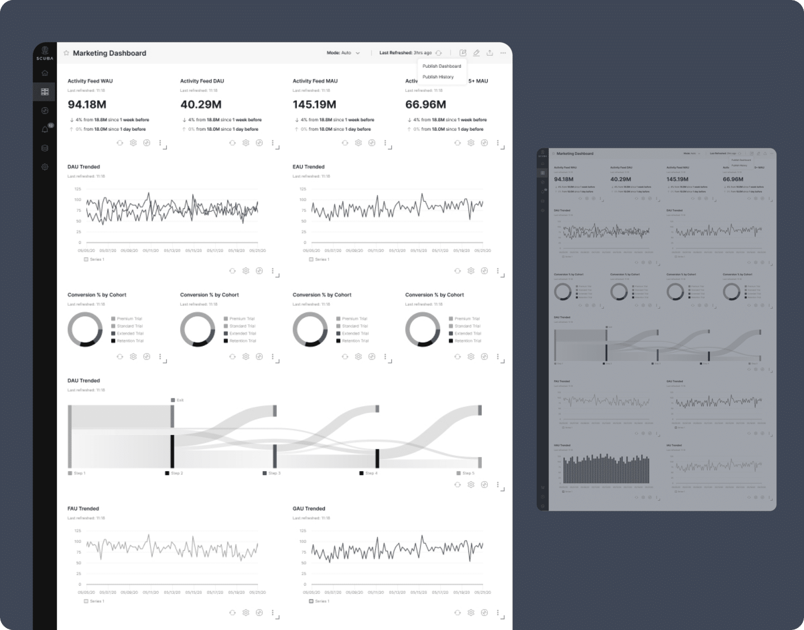
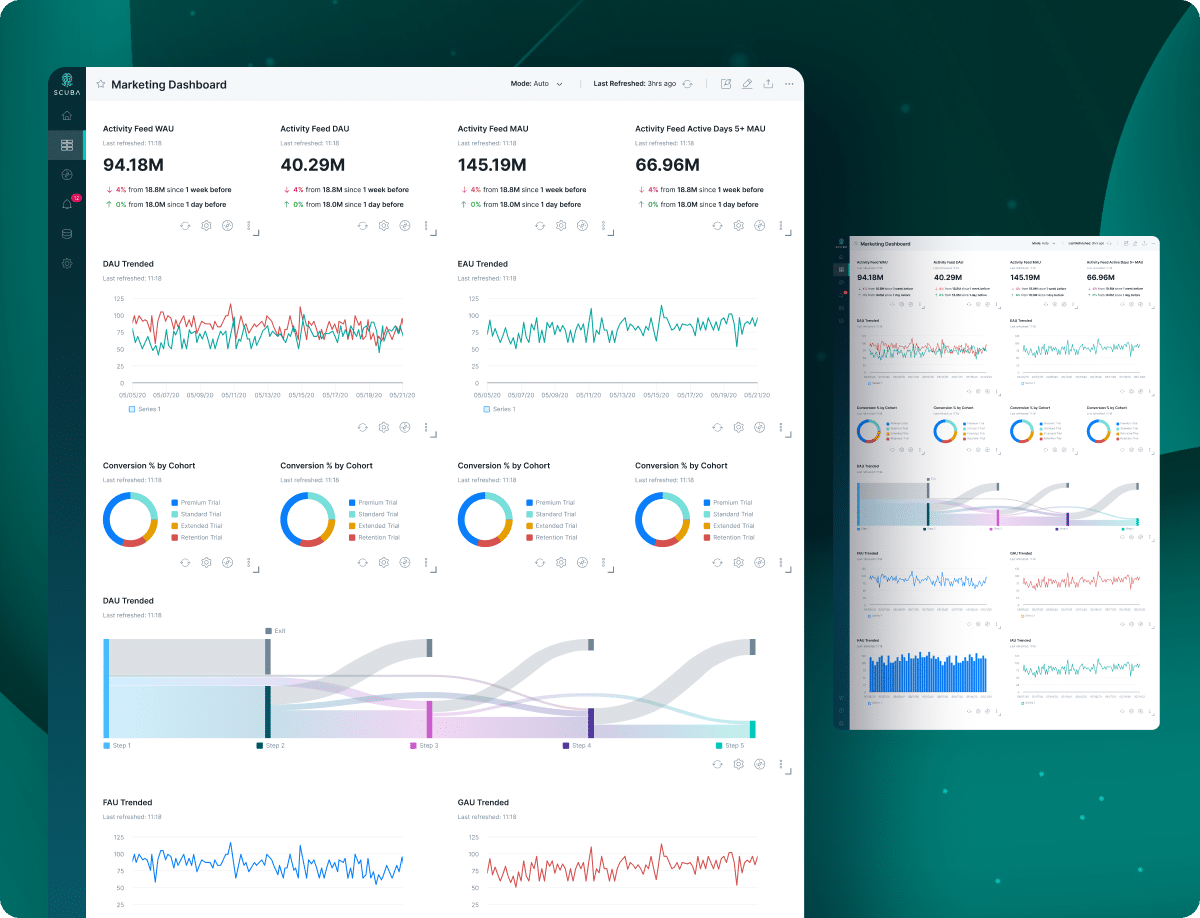
In the UX phase for Scuba, the directive was unmistakable: cut the clutter, and let the data breathe. Our focus was to distill the complexity of the user experience into a sleek, self-service haven. The challenge?
Making rich data digestible without dumbing it down. The result: a user-friendly layout that empowers customers to navigate their own path through a sea of insights.
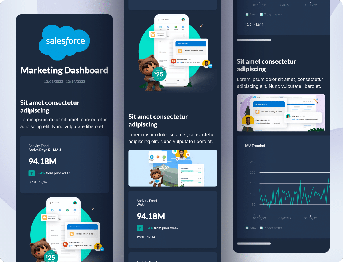
User Interface Design: Responsive
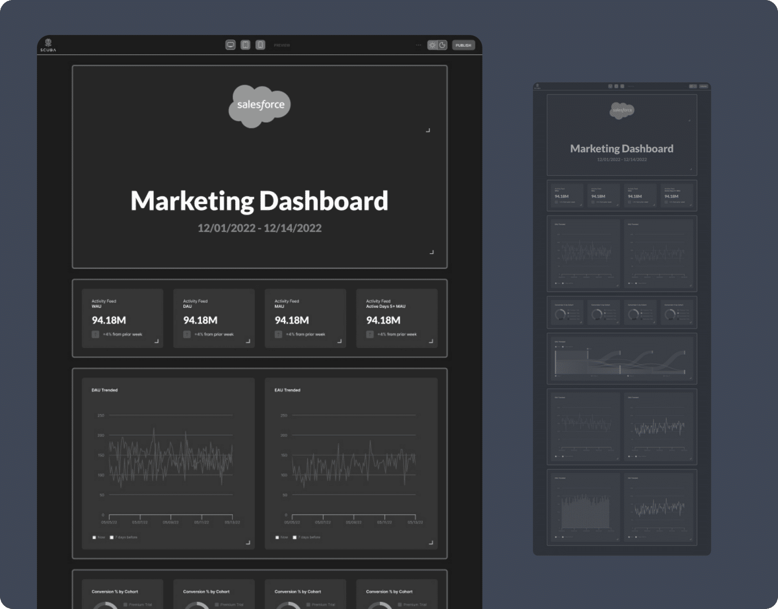
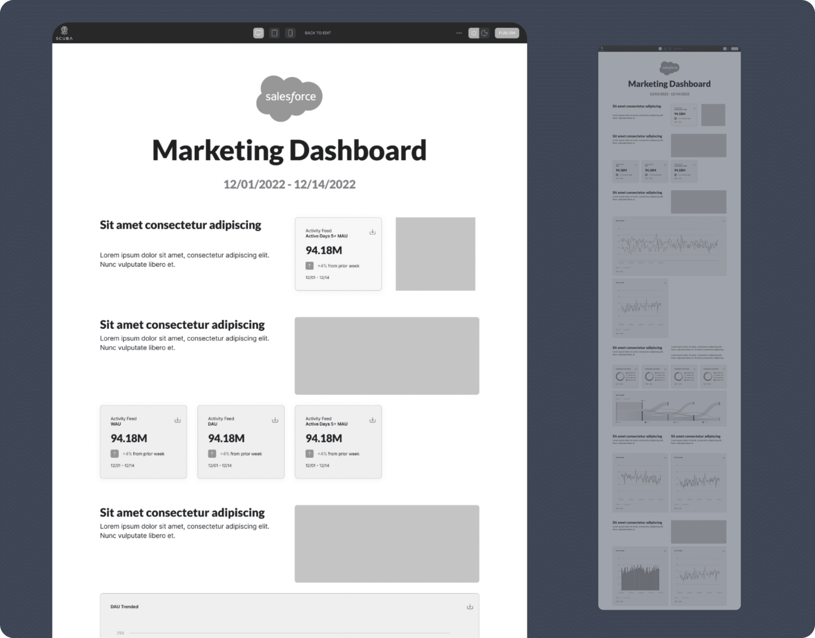
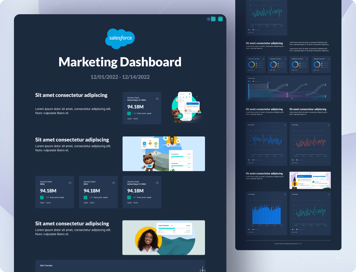
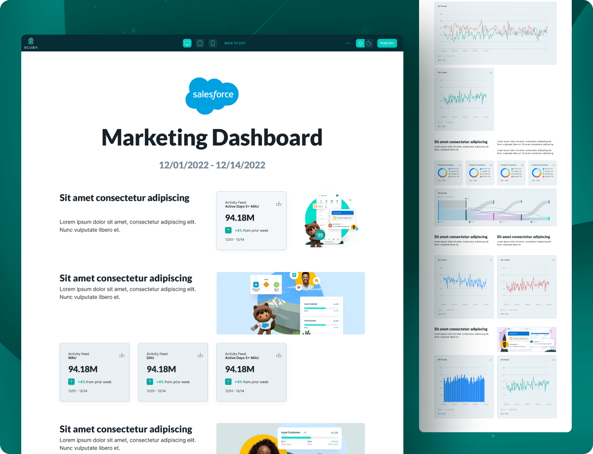
In the UI realm for Scuba, it was all about balancing brand integrity with customizable flair. While preserving the core Scuba aesthetic, I introduced a day-and-night mode toggle for the dashboard.
The aim? To offer users a bespoke viewing experience that’s both responsive and delightful.
The challenge was in the details—meticulously crafting a UI that felt both familiar and refreshingly new. We landed on a design that’s as dynamic as the data it showcases.
Who we impress
Transforming bold visions into digital excellence, as reflected in testimonials from Samsung, Apple, T-Mobile, and more.
“Creative27 excelled in designing websites and logos for two nonprofits I’ve worked with, adapting to our pace with utmost professionalism. Their designs, praised for both aesthetics and user experience, never missed a deadline.”

“Creative27 excelled in designing websites and logos for two nonprofits I’ve worked with, adapting to our pace with utmost professionalism. Their designs, praised for both aesthetics and user experience, never missed a deadline.”

Creative27 excels in UI/UX design, efficiently handling complex projects with clear communication and a focus on modern, user-centric solutions.

Creative27 excels in UI/UX design, efficiently handling complex projects with clear communication and a focus on modern, user-centric solutions.

Creative27 excels in UX/UI design, turning basic ideas into polished, intuitive designs, as shown in their successful wine app project. Their skill in creating elegant solutions and maintaining composure under pressure marks them for future success.

Creative27 excels in UX/UI design, turning basic ideas into polished, intuitive designs, as shown in their successful wine app project. Their skill in creating elegant solutions and maintaining composure under pressure marks them for future success.

Creative27 exceeded expectations with market research and comparative analysis, maintaining high enthusiasm and partnership throughout our project’s development.

Creative27 exceeded expectations with market research and comparative analysis, maintaining high enthusiasm and partnership throughout our project’s development.
“Creative27 is a highly talented and creative digital agency. Their resourcefulness and team spirit make them an excellent asset to any company.”

“Creative27 is a highly talented and creative digital agency. Their resourcefulness and team spirit make them an excellent asset to any company.”

Creative27 is a top-tier UI/UX agency we’ve partnered with on key projects. Their creative output, professionalism, and ability to deliver beyond expectations have consistently resulted in beautiful work.

Creative27 is a top-tier UI/UX agency we’ve partnered with on key projects. Their creative output, professionalism, and ability to deliver beyond expectations have consistently resulted in beautiful work.
“We worked with the Creative27 team & had terrific results. Creative27 was able to help us visualize & understand our project with great clarity & efficiency. It’s why we chose to work with them again & again!”

“We worked with the Creative27 team & had terrific results. Creative27 was able to help us visualize & understand our project with great clarity & efficiency. It’s why we chose to work with them again & again!”
“Besides their excellent creative abilities, what sets Creative27 apart is their tight process, quick turnaround, and consistency in delivering good quality work.”

“Besides their excellent creative abilities, what sets Creative27 apart is their tight process, quick turnaround, and consistency in delivering good quality work.”
Working with Creative27 on our flagship product was a pleasure. Their artistic design and UX mastery, along with deep product design discussions, were invaluable. Thank you!

Working with Creative27 on our flagship product was a pleasure. Their artistic design and UX mastery, along with deep product design discussions, were invaluable. Thank you!
Find out how we can put solutions like these work for you.
Click, submit, and consider us talking. 24 hours max.


